How Can We Help?
Basics
This chapter aims to introduce the fundamental concepts of digital twins, system requirements, login methods, and user interface, helping users understand and prepare to use FactVerse Designer.
Concepts
Digital Twin Template
Digital twin templates are used for a category of digital twins, with each template containing metadata, behavior trees, and resources for that category of digital twin. Templates can be used to create same category digital twins.
Metadata
Metadata is structured data abstracted and summarized from real objects, used to describe various aspects and content of the objects. Metadata includes the following components:
- Structure definition: A set of common attributes that describe a digital twin. This set of attributes typically corresponds to the functions, features, or information of the digital twin. For example, the Pose structure can define properties such as position, rotation, and speed of the twin.
- Attribute definition: Describes the nature or characteristics of the digital twin. Attributes are defined in the template, but actual attribute values are recorded in the digital twins created from the template. Note: Attributes must belong to a structure.
- Preset structures: A type of general-purpose preset structures provided to users, such as input port, output port, path, etc. Preset structures help users quickly set basic attributes and behaviors of the digital twin. For example, a path structure can be used to define the transportation path of the digital twin; users only need to set the start and end points, and the system will automatically generate the path planning.
Attributes are a general term for the nature and characteristics of a digital twin, covering various aspects such as production information, appearance attributes, status information, and usage attributes:
- Production information attributes: Used to describe the production information of the digital twin, such as model, batch, manufacturer, production date, etc.
- Appearance attributes: Define the visual characteristics of the digital twin, such as color, material, size, position, etc.
- Status attributes: Express the operational state of the digital twin, such as whether it is running, whether it is malfunctioning, whether it is under maintenance, etc.
- Usage attributes: Describe the performance and characteristics of the digital twin under specific uses, such as production efficiency, energy consumption, decibel levels, temperature during operation, etc.
Data types of attributes
FactVerse Designer supports the following data types of attributes:
| Type | Description | Definable attributes |
| Int | Integer type, used to describe integer physical quantities, such as 1, 2, 5. Value range: -2147483648 ~ 2147483647Step size: Add a specified value (i.e., step size) in each operation and repeat the operation.Unit: the measurement unit of attribute data, such as meters, centimeters. | Quantity, frequency, speed, etc. |
| Double | Describes physical quantities in floating-point format, with 8-byte precision, such as 1.2, 2.5, 3.0. It can be used to represent attributes that require precise numerical representation, such as “time”, “percentage”, and “exchange rate”. Value range: -2147483648 ~ 2147483647Step size: Add a specified value (i.e., step size) in each operation and repeat the operationThe measurement unit of attribute data, in string type. For example, meters, centimeters. | Temperature, humidity, power consumption, balance, mass, area, etc. |
| String | Also known as a text type, used to input text. Data length: The default set value is 10240 bytes. | ID, model, etc. |
| Bool | Also known as the Boolean type, it is a judgment type used for logical judgment. The value of a bool type attribute is either true (1) or false (0). | Operational status, check status, execution results, etc. |
| Vector3 | Used to describe physical quantities of three-dimensional space information, such as coordinates, rotation angles, scaling, and other attributes. Application: Position, rotation.Unit: The measurement unit of attribute data, in string type. For example, degrees, cm.Attribute value: In the format of x, y, z. | Placement position, placement angle, path positions, etc. |
| Color | Color format: The format is R, G, B, A. The first three numbers represent the RGB color values, and the fourth number represents the transparency value. Value range: Each number is an integer between 0 and 255. For example, 255, 87, 51, 128. | Appearance colors, status colors, etc. |
| Path | 0:x,y,z or 1:x,y,z, where 0 represents a straight line and 1 represents a curve. The coordinates of two points are separated by the “|” symbol. For example, 0:0,1,0|0:5,1,0 represents a straight path between the points (0,1,0) and (5,1,0). | Moving paths, transfer paths, transport paths, etc. |
| Date | Date format: YYYY-MM-DD, for example, 2024-08-09 | Production date, maintenance date, etc. |
| Time | Time format: HH:MM:SS, for example, 14:30:00 | Start time, landing time, stop time, etc. |
| Enum | Enum type format: A predefined list of values, for example: [01, 02, 03]. | Error codes and error types, product codes and product categories, etc. |
| List | Object array format: Used to store an ordered collection of elements, where each element can be of any type but must be of the same type. For example: [1, 2, 3], [“a”, “b”, “c”]. | Suitable for storing ordered collections of elements, such as sensor lists, device lists, path points collection, etc. |
| Dictionary | Key-value pair collection format: {key: value}, where each element can be of any type but must be of the same type. For example: {“ID”: “123”, “Status”: “Normal”}. | Suitable for storing data in a key-value pair structure, suitable for situations where quick lookup, addition, or modification of values based on unique keys is needed. Examples include usernames and their corresponding passwords, configuration options and their values, etc. |
In addition to the attributes of digital twins, there are also tree attributes. These attributes are stored in the behavior tree and can be temporarily stored and accessed.
Behavior tree
The behavior tree is the core mechanism for implementing digital twin content (including digital twins and digital twin scenes). It defines the intrinsic working methods of each digital twin in the digital twin scene, as well as the rules and principles governing the interactions and interrelations of the digital twins under specific environmental conditions.
Resources
Resources refer to the collection of various elements such as 3D models, images, and videos in the digital twin template. These elements are combined to form the 3D appearance of the digital twin template, such as a 3D model representing equipment, or drawings or videos illustrating operating steps. Each digital twin created using this template will inherit the appearance of the template by default, ensuring a consistent visual effect in the scene.
Digital Twin
A digital twin is a digital representation of a physical entity in the information world. Each digital twin is an instance created based on a digital twin template. A digital twin consists of four main parts: appearance, behavior tree, attributes, and data. The appearance defines the visual representation of the digital twin, the behavior tree determines its behavior, attributes define the digital twin’s static or dynamic characteristics, and data contains real-time or historical information related to the digital twin. Users can edit these parts as needed and drive the digital twin’s behavior through the behavior tree or data.
Digital twin scene
A digital twin scenario is a virtual view of a business environment composed of instances of digital twins. It may also include custom business logic and 3D decorative elements. The core of a digital twin scene is its layout, which primarily focuses on organizing digital twins.
The main functions of a digital twin scenario include:
- Digital twin layout: Users can add or remove digital twins in the scene, adjust each digital twin’s position, size, and other attributes through interactive operations, and also modify the digital twins’ attributes and connect connectable digital twins.
- Decorative layout: Users can add or remove various 3D models, 2D images, videos, and other resources as decorative elements in the digital twin scene, and adjust the position, size, and other attributes of these decorative elements through interactive operations.
- Path planning: Design the movement paths of digital twins within the scene to simulate the actions of equipment or personnel.
- Global operating logic: Define and manage the business logic in the scene to ensure that the interactions between digital twins and the overall behavior of the scene meet expectations.
Preparation
System requirement
| System | Minimum Configuration | Recommended Configuration |
| Windows PC | Software: Window10 or later Direct3D 11.0 or higher Hardware: CPU: Intel®Core™i5-6200U 2.30Ghz RAM: 8GB GPU: NVIDIA GTX 1050Ti | Software: Window10 or later Direct3D 11.0 or higher Hardware: CPU: Intel®Core™i7-11700 3.60Ghz RAM: 16GB GPU: NVIDIA GTX 3070 Ti |
| macOS | Software: Monterey 12.0.1 Hardware: CPU: Intel Core i7 RAM: 8GB GPU: Intel Iris Plus Graphics 640 | Software: Monterey 14 Hardware: Chip: Apple M1 RAM: 16GB |
Download
Before you start using FactVerse Designer, you need to download it first.
|
Platform |
Download address |
|
Windows PC |
https://apps.microsoft.com/store/detail/factverse-designer/9NJS5D6XZG0F?hl=zh-cn&gl=cn Download short URL:datame.sh/designer |
|
macOS |
Apple Store |
Acquiring Permissions
To gain access to the FactVerse platform and use FactVerse Designer, you need to contact your company’s administrator and request authorization. The company administrator will assign appropriate permissions based on your role and needs, ensuring you can smoothly access and use FactVerse Designer and related products and services. Once authorized, you can log in to FactVerse Designer and start using it.
Login
Regular login
To access FactVerse Designer, you can use your FactVerse user account and password to log in. Here are the steps to log in:
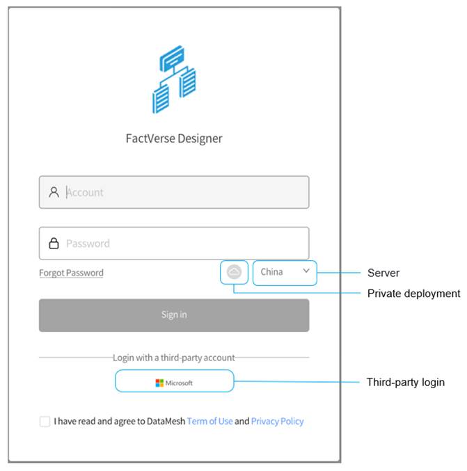
1. Open the FactVerse Designer login page.
2. Configure server:
a) Select public server: If your enterprise is deployed on a public server, choose the server belonging to the enterprise account from the server list.
b) Set up private deployment server: If your enterprise uses a private deployment server, you need to click on the private deployment icon ![]() to set the exclusive service code.
to set the exclusive service code.
3. Enter your Account and Password: In the login dialog, enter your FactVerse user account and password.
4. Check the box “I have read and agree to the DataMesh ‘Terms of Use’ and ‘Privacy Policy’”, then click the Sign in button.
a) If you belong to only one enterprise account, the homepage will be displayed directly.
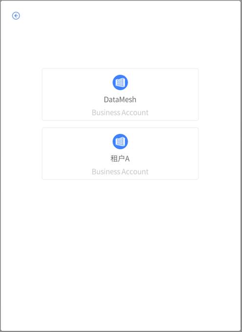
b) If you have multiple enterprise accounts, a list of enterprise accounts will be shown. Select the enterprise account you want to use, and then the homepage will be displayed.
Third-party login
FactVerse Designer supports using third-party login by utilizing Microsoft’s identity and access management service, Microsoft Entra ID, to enhance user security when using FactVerse platform. Below are the steps for using third-party login:
1. Open the FactVerse Designer login page.
2. Configure server:
a) Select public server: If your enterprise is deployed on a public server, choose the server belonging to the enterprise account from the server list.
b) Set up private deployment server: If your enterprise uses a private deployment server, you need to click on the private deployment icon ![]() to set the exclusive service code.
to set the exclusive service code.
3. Check the box “I have read and agree to the DataMesh ‘Terms of Use’ and ‘Privacy Policy’” option.
4. Click the Microsoft icon and then enter your third-party account credentials for login.
User interface
Homepage
Upon successful login, you will be directed to FactVerse Designer’s homepage. The homepage provides you with access to the editing interface, allowing you to quickly access recently edited digital twin templates and digital twin scenes.
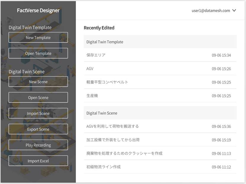
In the homepage, you can perform the following actions:
1. New Template: Create brand-new digital twin templates.
2. Open Template: Open existing digital twin templates for editing and customization.
3. New Scene: Create a new scene where you can perform scene layout and configure runtime logic for the visualization and interactive operation of the digital twin.
4. Open Scene: Open an existing scene for viewing and editing.
5. Import/Export Scene:
-
- Import Scene: Allows you to import scenes from the Hands-On Lab, enabling you to use the content from Hands-On Lab. For instructions on using Hands-On Lab, refer to the FactVerse Hands-On Lab.
- Export Scene: Supports exporting scene files for sharing and backup.
6. Recently edited: On the homepage, you can see a list of recently edited digital twin templates and scenes. This feature enables you to quickly access recently used templates and scenes, improving your workflow efficiency.
7. Play Recording: Click the “Play Recording” button to play back previously recorded scenes.
8. Import Excel: Supports importing Excel spreadsheets to create digital twins in bulk.
Template Editor
In FactVerse Designer, by clicking the New Template button on the homepage or opening any digital twin template, you will enter the Template Editor interface. In the Template Editor, you can define a specific type of digital twin in detail, including metadata, behavior tree, resources, etc.
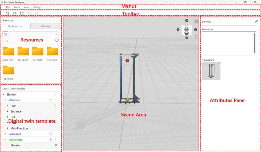
Menus
The “Menus” in the Template Editor contain commonly used tools and commands for creating digital twin templates. Below are the functions of each menu:
| Menu | Function |
| File | New: Create a new template. If the current template has not been saved yet, it will prompt you to save it. Open: Open an existing template from the cloud. If the current template has not been saved yet, it will prompt you to save it. Save: Save the current template content. Save as: Choose a location in the cloud directory to save the template and save the current template as a different one. Export as .xlsx file: Export a spreadsheet used for batch creation or modification of digital twin. Close: Close the current template and return to the main page. If the current template has not been saved yet, it will prompt you to save it. Quit: Exit DataMesh FactVerse Designer. If the current template has not been saved yet, it will prompt you to save it. |
| Tools | Dimensional Movement: Used to enable or disable drag navigation, helping users to linearly drag roles in the scene. Performance Statistics: Displays key data such as memory, Draw Calls, Batches, FPS, and other valuable information. |
| View | Ground grid: Show or hide the grid for planes at a height of 0 in the scene. View cube: Show or hide the view cube, viewpoint reset button, and projection switch button in the scene area. |
| Settings | Language: Used to switch languages. Simplified Chinese, Traditional Chinese, English, Japanese. Account: User Account: Displays the currently logged-in user account. Logout: Logs out the current user account. Upload Log: Allows you to upload the latest seven logs to the DataMesh FactVerse Services platform. About: View the current application’s version number. |
Toolbar
In the Template Editor, the “Toolbar” contains commonly used commands as listed in the table below:
|
Icon |
Description |
|
|
Home button: Clicking the home button will navigate to the main page. If there are unsaved modifications to the current template, it will prompt whether to save the current template. |
|
|
Save button: Save the newly created or modified template. |
Save as button: Clicking the “Save as” button allows you to save the current template as a new file. | |
|
|
Undo button: Undo the user’s previous action. |
|
|
Redo button: Restores the user’s previously undone action. |
Resources
The Resources pane in the Template Editor is in the left pane of the interface. You can resize the Resources pane by dragging the bottom or right edge of the pane. Additionally, clicking the title of the Resources pane allows you to expand or collapse it.
The Resources pane is divided into two sections: My Resources and Libraries
My Resources
In the My Resources section, you can access all available 2D and 3D resources. These resources include various elements and components that you can use to design and customize your template.
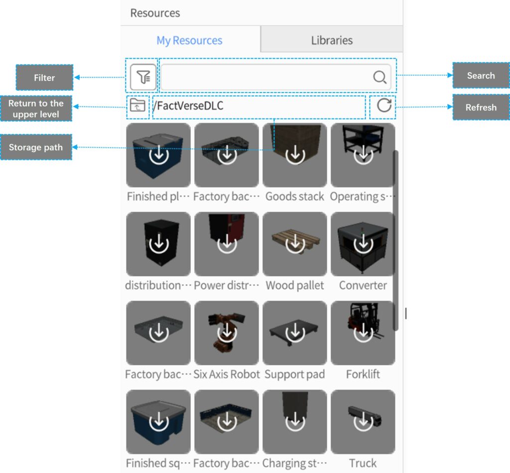
Below are the features and interface elements in My Resources:
- Search: You can use the search box in My Resources to perform a fuzzy search for resources based on their names.
- Filter: By selecting tags, you can filter the resources in My Resources to display only those that have the chosen tags.
- Storage Path: Shows the storage path of the resource. Clicking
 allows you to return to the upper level in the path.
 - Refresh: Clicking the refresh button
 allows you to update the resource materials. After uploading new resources, click refresh to view them in My Resources.
Resource Status:
- Not Cached: Cloud-based materials have not been cached locally, and the icon appears in gray.
- Downloading: When you click on a not cached material, the download process begins, and the download progress is displayed.
- Cached: The icon is lit up, indicating that the material has been fully downloaded and can be directly dragged and dropped into the scene for use.
Libraries
The Libraries section contains pre-set digital twin content provided by the system, including pre-defined basic elements such as source, conveyors, and AGVs (Automated Guided Vehicles). These pre-set basic elements can be used as templates to help users quickly create complex digital twin templates.
In addition, the Libraries section also includes built-in system utilities such as subtitles, components, and shapes. These utilities enable users to add additional functionality and visual effects to the digital twin during the template editing process, enhancing interactivity and visual appeal.

Digital Twin Template
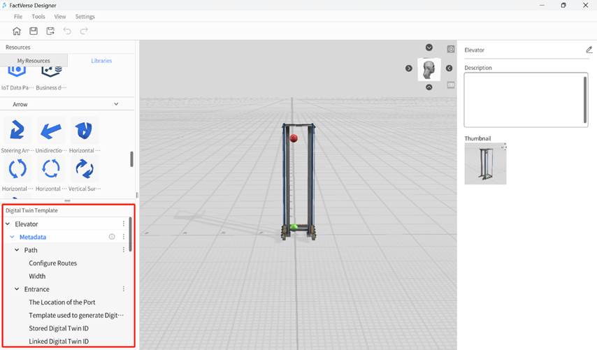
The Digital Twin Template pane is located below the Resources pane and is used to display the metadata, resources, and behavior tree of the current template. It is an essential component of the Template Editor interface, providing comprehensive viewing and management capabilities for the digital twin template content.
Scene Area
The “Scene Area” in the Template Editor is in the central pane of the interface and serves as the primary workspace for editing digital twin templates. Here, you can drag and drop models or tool resources from the Resources pane to start creating your digital twin template.
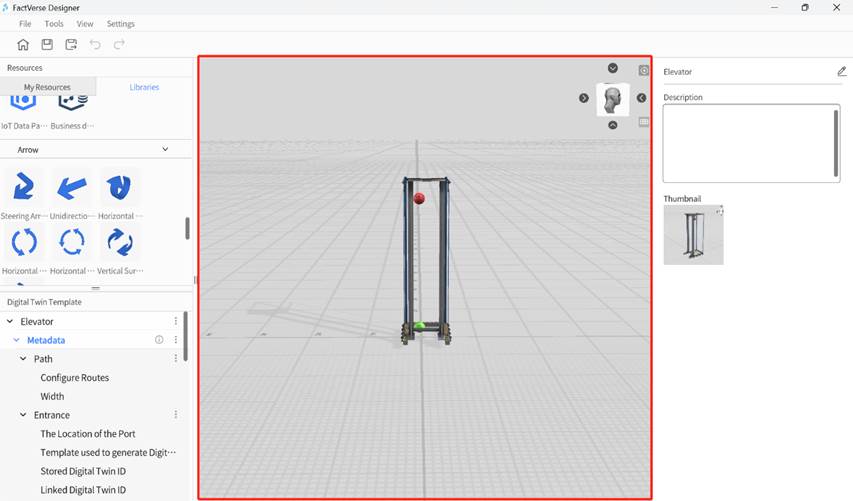
The Scene Area includes the following elements:
- Added Resources: You can add various resources, such as models, to the Scene Area for layout and editing purposes.
- View cube
 : Located in the top right corner of the Scene Area, the 3D Scene Gizmo displays the current viewpoint direction. Clicking the scene gizmo allows you to switch between six views (Front, Back, Left, Right, Top, Bottom).
 - Viewpoint reset button
 : Clicking the reset button will bring the viewpoint back to the initial perspective, making it easy for you to readjust the view.
 - Projection switch button
 : By default, the perspective projection is used. You can switch to orthographic projection by clicking on the toggle button.
Attribute Pane
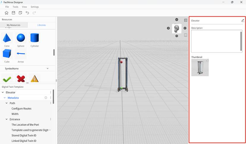
The Attribute Pane of the Template Editor is in the right-side pane of the Template Editor interface. It is used to edit the attribute information of the current template and the attributes of resources in the scene.
Main functions:
- Edit template attributes: When you click on a blank area in the scene, the Attribute Area will display the current template’s attribute information. Here, you can modify the template’s name, description, and thumbnail information.
- Edit resource attributes: When you select a resource in the scene, the Attribute pane will show the selected resource’s attributes. You can adjust and set attributes of the resource here, such as size, position, color, etc.
- Data binding: The Attribute pane allows you to perform data binding, linking the attributes of resources to other data sources. Through data binding, you can achieve automatic updates and interactive effects for the attributes of digital twins. For example, you can use external data to drive rotations, movements, and other posture changes of the digital twin, enabling more realistic and real-time simulation effects.
Scene Editor
By clicking the New button or the Open button of the Scene section on the homepage, you can enter the Scene Editor interface. In the Scene Editor, you can organize digital twins created from digital twin templates into a digital twin scene, which includes functions such as digital twin layout and connections between the input port and output port.
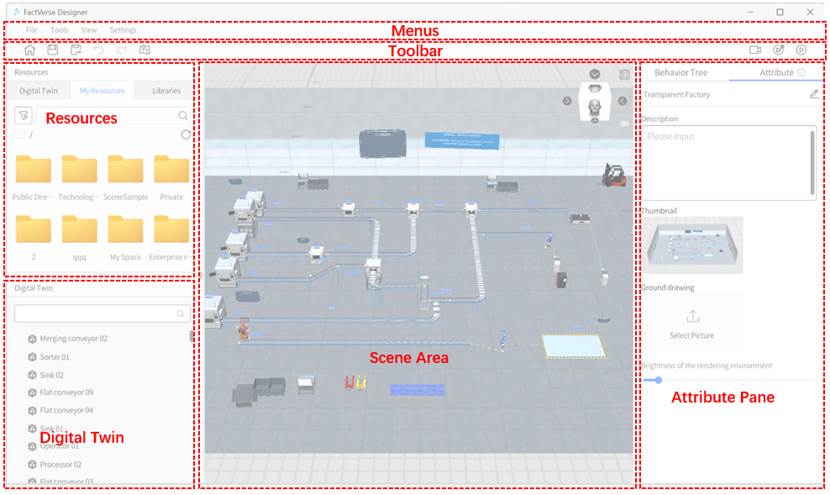
Menus
The Menus in the Scene Editor contains common tools and commands that you may use when creating twin scenes. Here are the functionalities of each menu:
| Menu | Function |
| File | New: Create a new scene. If the current scene has not been saved yet, it will prompt you to save it. Open: Open an existing scene from the cloud. If the current scene has not been saved yet, it will prompt you to save it. Save: Save the current scene. Save As: Choose a location in the cloud directory to save the scene and save the current scene as a different one. Export: Export the digital twin scene as a digpkg format file and save it. Close: Close the current scene and return to the main page. If the current scene has not been saved yet, it will prompt you to save it. Output: Exit DataMesh FactVerse Designer. If the current template has not been saved yet, it will prompt you to save it. |
| Tools | Move Gizmo: Used to enable or disable drag navigation, helping users to linearly drag roles in the scene. Operating Parameter: Displays key data such as memory, Draw Calls, Batches, FPS, and other valuable information. |
| View | Light: Show or hide lights in the scene. Path: Show or hide paths in the scene. Ground grid: Show or hide the grid for planes at a height of 0 in the scene. View cube: Show or hide the view cube, viewpoint reset button, and projection switch button in the scene area. Port connections: Show or hide ports and port connections in the scene. |
| Settings | Language: Used to switch languages. Simplified Chinese, Traditional Chinese, English, Japanese. Account: User Account: Displays the currently logged-in user account. Logout: Logs out the current user account. Upload Log: Allows you to upload the latest seven logs to the DataMesh FactVerse platform. Change rendering environment: Modify the rendering environment of the digital twin scene. About: View the current application’s version number. |
Toolbar
In the Scene Editor, the “Toolbar” contains the following commonly used commands as shown in the diagram below:
| Icon | Description |
| Home button: Clicking the home button will navigate to the main page. If there are unsaved modifications to the current scene, it will prompt whether to save the current scene. | |
| Save button: Save the newly created or modified scene. | |
| Save as button: Clicking the “Save as” button allows you to save the current template as a new file. | |
| Undo button: Undo the user’s previous action. | |
| Redo button: Restores the user’s previously undone action. | |
| Path map button. | |
| Record button, record video. | |
| Breakpoint debugging button,click the breakpoint debugging button to enter the behavior tree debugging runtime mode. | |
| Play button, preview scene. |
Resources
In the Scene Editor, the Resources pane is located on the left side of the interface. You can adjust the size of the Resources pane by dragging the bottom or right edge. Additionally, you can click on the title of the Resources pane to expand or collapse it.
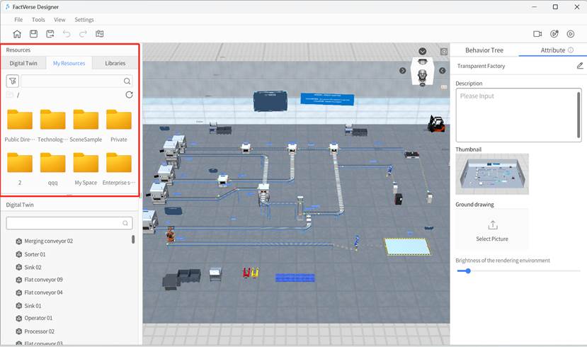
The Resources pane consists of three sections: Digital Twin, My Resources, and Libraries.
- Digital Twin: In the Digital Twin section of the Resources pane, you can use digital twin templates to create digital twins and use them in your scene.
- My Resources: This section functions similarly to the “My Resources” in the Template Editor. It contains all the 2D and 3D resources available to you. You can search and filter to find the resources you need.
- Libraries: The Libraries section includes system-preset digital twin templates and built-in tools such as subtitles, components, and shapes. These tools can help you quickly add additional functionality and effects to enrich your twin scenes.
Digital Twin
In the scene editor, the Digital Twin pane is located below the Resources pane and is used to display all elements in the current scene, including digital twins, models, tools, documents, and lights.
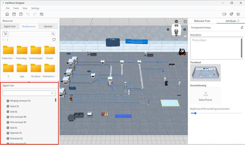
The Digital Twin pane in the Scene Editor provides the following functionalities:
1. Show or hide digital twins:
 : Currently visible; clicking the show icon will switch to the hidden state.
  : Currently hidden; clicking the hide icon will switch to the visible state.
2. Select a digital twin: Clicking the digital twin’s name will select the digital twin for further editing or operations.
3. Delete digital twin ![]() : Clicking the delete icon will remove the digital twin from the scene.
: Clicking the delete icon will remove the digital twin from the scene.
4. Lock digital twin ![]() : Locked digital twins cannot have their poses changed and will appear in a locked state in the digital twin list. Locking scene layout models during the construction process helps prevent accidental changes and improves the efficiency of digital twin content creation.
: Locked digital twins cannot have their poses changed and will appear in a locked state in the digital twin list. Locking scene layout models during the construction process helps prevent accidental changes and improves the efficiency of digital twin content creation.
5. Resize the digital twin pane: You can adjust the pane’s size by dragging its right edge.
6. Expand the pane: Click the title of the digital twin pane to expand it.
Scene Area
The “Scene Area” is in the central pane of the Scene Editor interface and serves as the primary workspace for editing digital twin scenes. In this area, you can layout, organize, and edit digital twins, models, and tools to create your desired digital twin scenes.
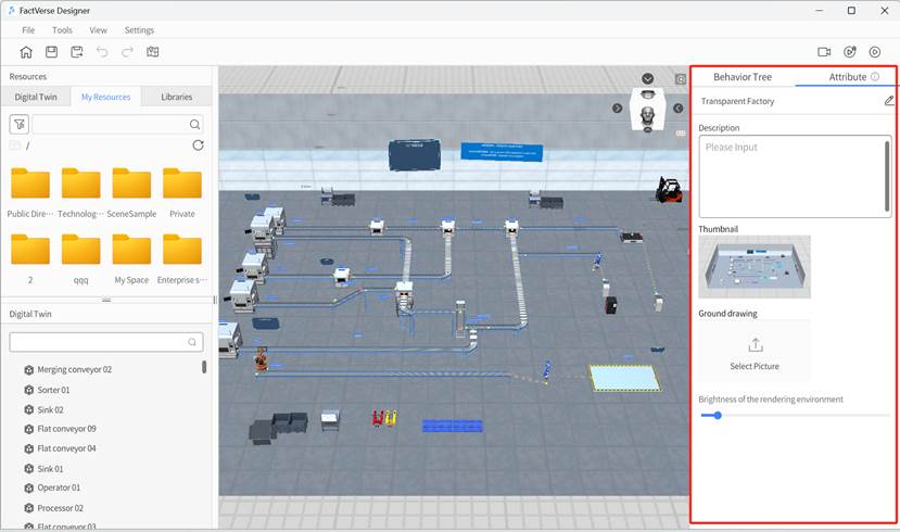
The main features of the Scene Area in the Scene Editor include:
- Resources layout: You can drag and drop digital twins, models, or tools from the Resources pane into the Scene Area, placing them in the desired positions to start building your digital twin scenes.
- Editing and organizing: In the Scene Area, you can edit and organize the added digital twins and models, adjusting their positions, sizes, rotation angles, and more to achieve the desired scene effects.
- Multi-view Display: The scene area supports multi-view display. By clicking on the view cube in the top right corner of the scene area, you can quickly switch between six views (Front View, Back View, Left View, Right View, Top View, Bottom View). This allows you to better observe and edit the scene from different perspectives.
- Viewpoint reset: Clicking the viewpoint reset button
 in the Scene Area allows you to return to the initial view, making it convenient for you to adjust and perform operations during the editing process.
 - Projection switching: You can switch between perspective projection and orthographic projection in the Scene Area to meet different scene requirements.
Attribute Pane
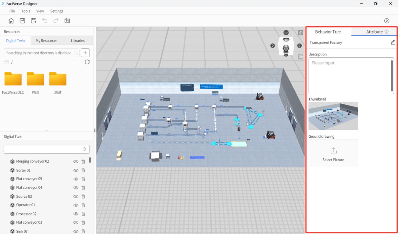
The “Attribute pane” of the Scene Editor is located in the right-side pane of the interface and primarily supports the following functions:
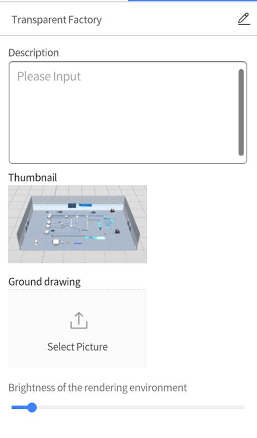
Edit scene attributes and behavior tree: When you click on a blank space in the scene, the Attribute pane displays the scene’s attributes. You can view and edit scene attributes such as name, description, and thumbnail. Additionally, you can switch to the behavior tree tab, which displays the behavior tree for the current scene. By clicking on any behavior tree, you can enter the behavior tree editor interface for corresponding editing and adjustments.
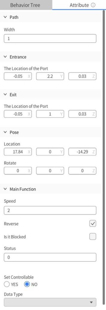
Edit digital twin attributes and behavior tree: When you select a twin body in the scene, under the Attribute tab in the attribute pane, the information about the selected digital twin is displayed, including its position, main functions, ports, etc. This allows you to make precise settings and adjustments. You can switch to the behavior tree tab, which displays the behavior tree for the current scene. By clicking on any behavior tree, you can enter the behavior tree editor interface for corresponding editing and adjustments.
Edit model resource attributes: When you select a model resource in the scene, the attribute pane displays the selected model resource’s attribute information. Here, you can adjust and set the pose attributes of the model resource or its substructures. You can also set the model or its substructure as Backface culling.
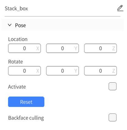
When a selected model or its subcomponent is set as “Backface culling,” observing the model or subcomponent from the back will make it disappear. This feature is mainly applied to scene models. For example, if you have a virtual factory model and select “Backface culling” for the external walls, when observing the factory from the outside, the external walls will be hidden, displaying only the internal structure and facilities, improving the visibility of the internal environment.
Edit other tool resource attributes: When you select a tool resource in the scene, the attribute pane displays information about the tool, such as color, position, and associated data for charts. You can make precise settings and adjustments through the attribute pane.
Scene playback interface
Click the play button ![]() in the toolbar to enter the scene playback interface.
in the toolbar to enter the scene playback interface.
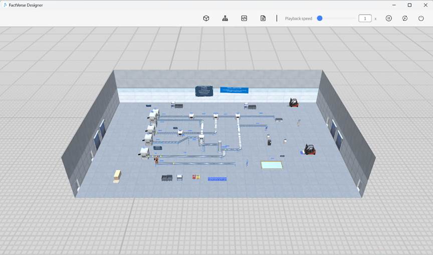
The playback interface toolbar is as follows:

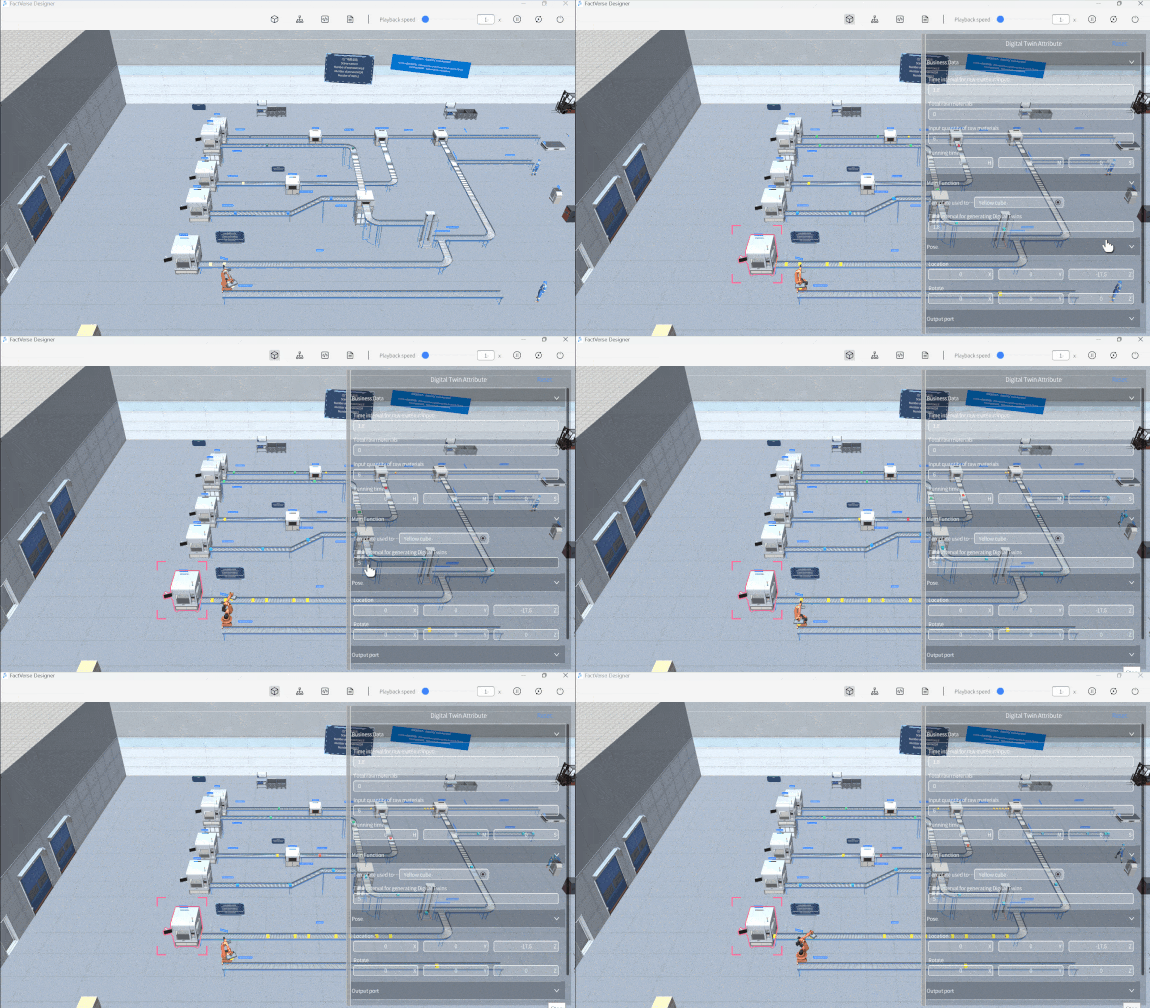
In the scene playback interface, by using the following debugging windows, the requirements for scene debugging and production line optimization can be achieved:
- Attributes: The “Attribute Pane” of the digital twin can be used to change the digital twin’s attribute values and observe the scene performance after the numerical changes.
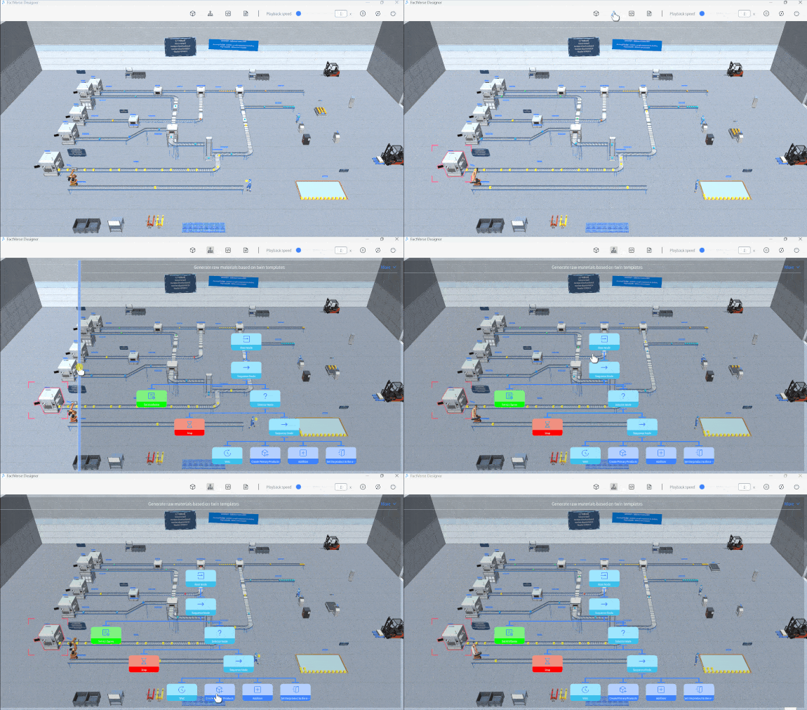
- Behavior tree preview: It displays the real-time execution status of the selected digital twin’s behavior tree. Nodes that are currently executing are shown in light blue, nodes that have not been executed are shown in dark blue, and green and red colors represent successful and failed return values of these nodes, respectively. This visualization facilitates the traversal of the behavior tree, making error localization more intuitive and simplifying the debugging process.
- Simulation data debugging: It alters digital twin attributes by sending simulation data messages to digital twins within the scene, enabling scene debugging and optimization.
- Logs: The log pane is used to print the output of Log nodes in the behavior tree.
Behavior tree editor
FactVerse Designer provides an intuitive visual Behavior Tree Editor, eliminating the need for coding to create complex behavior logic for digital twins.
The Behavior Tree Editor interface consists of the following main components: Toolbar, Node Menu, Behavior Tree Editing Area, and Attribute Pane. Through the combination of the Node Menu, Behavior Tree Editing Area, and Attribute Pane, the Behavior Tree Editor offers a visual and interactive interface, enabling users to easily create, edit, and adjust the structure and behavior logic of behavior trees.
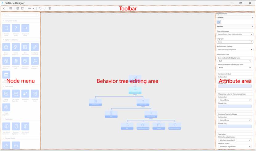
Toolbar
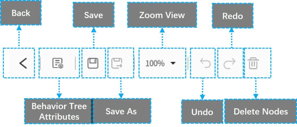
The Behavior Tree Editor’s toolbar contains a series of commonly used functional buttons for operating and managing the editor. Below are explanations of the toolbar buttons and their functions:
- Back: The “Back” button is used to close the current behavior tree editor and return to the template or scene editor interface. After clicking this button, the behavior tree editor will be closed, and there will be a prompt to save or save as before exiting.
- Behavior Tree Attributes: This button is used to open or access the settings for the behavior tree’s attributes.
- Save: The Save button is used to save the currently edited behavior tree to the FactVerse platform.
- Save As: The Save As button allows users to save the currently edited behavior tree with a different name or path.
- Zoom View: The Zoom View button allows users to adjust the zoom level of the behavior tree in the editor interface. By clicking the Zoom View button, users can zoom in or zoom out the view of the Behavior Tree Editor to better observe and edit the details of the behavior tree.
- Delete Nodes: The Delete nodes button is used to remove the selected node. When a user selects a node and clicks the Delete nodes button, the node will be removed from the behavior tree.
Node Menu
The “Node Menu” is located on the left side of the Behavior Tree Editor interface. From the Node Menu, you can select the appropriate nodes and then drag them into the Behavior Tree Editing Area to create and edit the structure of the behavior tree.
Behavior tree editing area
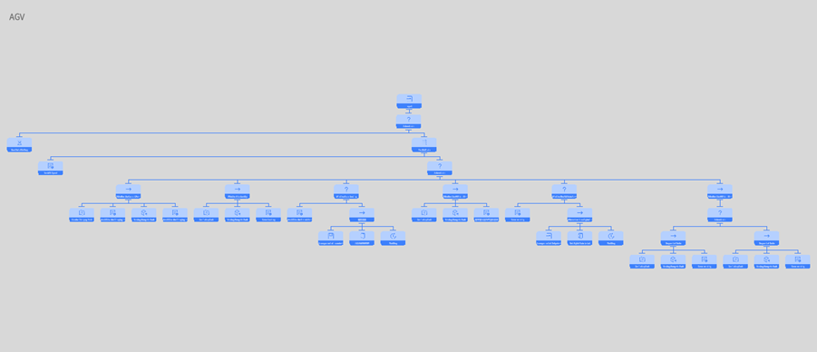
The “Behavior tree editing area” is the primary workspace for creating and editing the structure and logic of the behavior tree. Users can drag nodes into the editing area, organize them into a tree-like structure, and define the relationships and order between nodes. Users can adjust the positions of nodes and connect the lines between nodes. By working in the Behavior tree editing area, users can intuitively build and modify the structure of the behavior tree.
Attribute Pane
The Attribute Pane is located on the right side of the Behavior Tree Editor interface and is used to set the attributes and execution conditions of behavior tree nodes. When a user selects a node, the Attribute pane displays the relevant attributes and conditional parameters of that node, which the user can set and adjust. The Attribute Pane also allows users to define the execution conditions of nodes, i.e., under what circumstances the node should be executed or skipped. By setting the execution conditions of nodes, users can control the behavior and execution logic of nodes based on specific conditions.

Additionally, users can edit the name of the behavior tree in the attribute area to better manage and identify different behavior trees.
Virtual Factory DLC
The Virtual Factory DLC is a digital twin content expansion package introduced by DataMesh, primarily targeting discrete manufacturing factories. By leveraging digital twin technology, it aims to improve the efficiency of execution in different business processes, including production planning, operation supervision, and layout planning, while also reducing overall manufacturing operational costs.
The Virtual Factory DLC includes common factory elements such as source, conveyor belts, converters, AGV carts, and operators. Enterprises subscribed to FactVerse Designer can use these preset factory elements directly when creating scenes or customize them based on this DLC to meet specific requirements.
Virtual Factory DLC content
Models
The models in the Virtual Factory DLC serve as background and decorative elements in scenes, enhancing the realism of digital twin scenes. These models can also serve as the foundation for customized digital twin templates, allowing users to create specific types of digital twins, such as equipment and operators.
The Virtual Factory DLC includes several types of models:
- Background models: These three-dimensional models serve a decorative or background role in scenes or environments, enhancing the realism and visual appeal of the setting without serving as the primary interactive elements. Examples include factory backgrounds, storage boxes, stacks, and operating stations.
- Product models: Representing different types of products, each color and shape signifies a different product category. Examples include yellow balls, red cubes, and finished plastic boxes.
- Production equipment models: These models represent various production and transport equipment, including conveyor belts, robot, AGV, etc., used to simulate and display the actual equipment used in factories.
- Operator models: Used to simulate operators or personnel in a factory environment.
Digital twin templates
The Virtual Factory DLC provides various preset digital twin templates, including product templates and production equipment templates. These templates aim to simplify the process of creating virtual factory scenes for users and provide highly configurable simulation experiences.
- Product templates: These can be attached to production equipment to simulate the actual production of products in the factory. Examples include templates for yellow ball products, blue cube products, etc.
- Production equipment templates: These templates include robot, AGV, etc. Users can use these templates to create digital twins for various production equipment, allowing them to simulate the production processes in the factory, including automation, transportation, and material handling.
- Operator templates: Operator templates cover preset settings for appearance, clothing, and actions, making it easy for users to add and configure operators in their virtual factory scenes.
Digital twin scenes
The Virtual Factory DLC includes four digital twin scenes, allowing users to simulate and learn basic production line operations and management.
- Primary logistics line: This scene allows users to simulate and learn basic logistics line operations and management, including processes such as raw material generation and transport.
- Conditional sorting scene: This scene focuses on simulating the conditional sorting process, enabling users to understand and optimize material sorting operations under specific conditions. Users can configure the behavior tree of the sorting equipment through drag-and-drop, understanding the ability to sort based on the coordination of the behavior tree and digital twin attributes.
- Robot sorting scene: In this scene, users can delve into the operation of robot in the sorting process, including precise grasping and placing of materials. By dragging and dropping the behavior tree mechanism of the robot, users can understand the ability to express actual motion actions of the device through model animations.
- Transparent factory: A digital twin transparent factory refers to the real-time monitoring, analysis, and visual representation of a factory’s production process, equipment status, product quality, etc., through digital technology. This comprehensive transparency enables the entire factory’s production and operations to be visualized. The foundation of a digital twin transparent factory lies in digital twin technology, which precisely corresponds the physical factory to a digital model, allowing for comprehensive simulation and optimization of the factory’s production.
Use Virtual Factory DLC
The Virtual Factory DLC is stored in the “Public Directory” folder and is visible to all users with FactVerse Designer permissions. Users can use the Virtual Factory DLC in FactVerse Designer for various purposes.
The primary use cases for the Virtual Factory DLC are as follows:
- Viewing DLC content, including DLC directories and list contents, in the digital twin module of the FactVerse platform.
- Referencing DLC scenes and digital twins in other functional modules of the FactVerse platform. Currently, the equipment inspection module can reference scenes, and the data fusion module can reference digital twins.
- Viewing, saving, and editing DLC content in FactVerse Designer. Note: Content that supports saving as a new file includes templates, behavior trees, digital twins, and scenes; models in the DLC cannot be saved.
Edit templates in Virtual Factory DLC
If you need to edit templates in the Virtual Factory DLC and save changes, follow these steps:
- Click the Open Template button under the Digital Twin Template on the homepage of FactVerse Designer to open the resource window.
- In the resource directory, find and select the preset template in the Virtual Factory DLC that you want to edit. Click “Open” to open this preset template in the template editor.
- In the template editor’s toolbar, click
 to save this preset template to another directory.
 - Edit the template, such as adding model resources, adjusting the position and rotation angle of model resources, etc.
- After completing the editing, click
 to save your changes.
Edit behavior trees in Virtual Factory DLC
When you need to edit preset behavior trees in the Virtual Factory DLC and save changes, you should open the behavior tree in the template editor or scene editor and then edit it after saving it as a new file.
For editing preset behavior trees in a newly created template, follow these steps:
1. Click the New Template button under Digital Twin Template on the FactVerse Designer homepage to create a new template.
2. In the template editor’s Digital Twin Template pane, click ︙ next to Behavior Tree, then select Add Behavior Tree to open the behavior tree list.
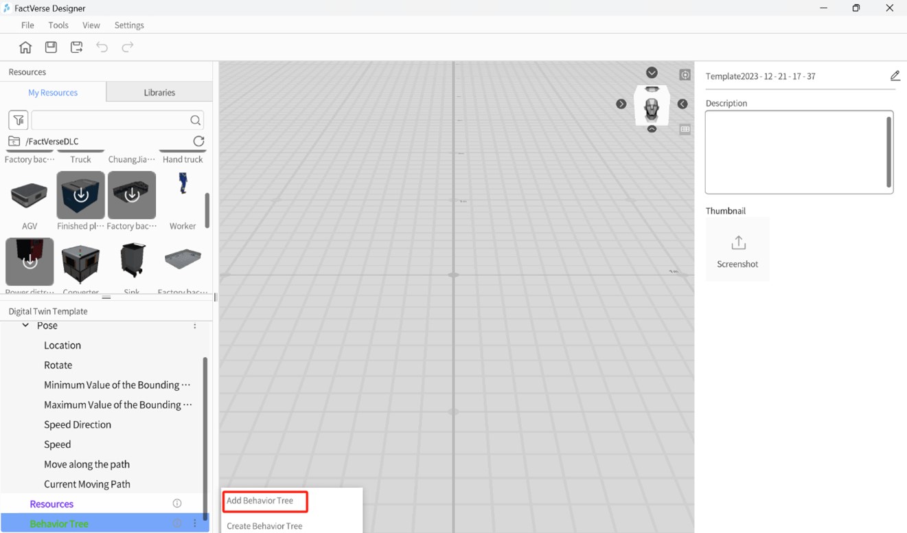
3. In the behavior tree list, select the preset behavior tree in the Virtual Factory DLC that you want to edit. This behavior tree will be added to the template.
4. On the Digital Twin Template pane, double-click the behavior tree’s name to open it in the behavior tree editor.
5.In the behavior tree editor’s toolbar, click ![]() to save this preset behavior tree to another directory.
to save this preset behavior tree to another directory.
6. Edit the behavior tree, such as adding or removing behavior tree nodes and modifying node attribute settings.
7. After editing, click ![]() to save your changes.
to save your changes.
Edit scenes in Virtual Factory DLC
When you wish to edit scenes in the Virtual Factory DLC and save changes, follow these steps:
1. Click the Open Scene button under Scene on the FactVerse Designer homepage to open the resource window.
2. In the resource directory, find the Virtual Factory DLC scene you want to edit, click Open to load it in the scene editor.
3. In the scene editor’s toolbar, click to open the Save As window.
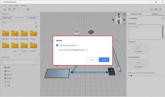
When saving the scene, you can choose whether to save digital twin data within the scene:
- Save As (Scene Only): If you only save the scene as a new file, modifying digital twins in the scene will affect the original digital twins in the scene. Note: For DLC scenes, it is only supported to modify content other than digital twins in the scene.
- Save As (Scene and Digital Twins): If you choose to save both scene and digital twin as a new file, modifying digital twins will not affect the original digital twins in the DLC.
4. In the Save window, choose the storage directory, specify the scene name, and then click Confirm to complete the scene’s save as process.
FactVerse Hands-on Lab
FactVerse Hands-on Lab is a training package created based on the content of the Virtual Factory DLC. It includes training videos and practical digital twin scene content. Through these training materials, you can gain a deep understanding of digital twin scene construction, experience rich materials and critical business instances to enhance your operational capabilities, and quickly optimize workflows.
Import Hands-on Lab scenes
Using the import function of FactVerse Designer, you can import scene files (.digpkg files) from the Hands-On Lab. Note: Each import operation will overwrite the previous Hands-On Lab scene file.
1. Download the Hands-on Lab package to a local folder.
2. On the homepage, click the Import Scene button.
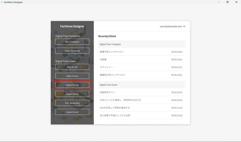
3. In the Open Scene window, select the scene file to import and click Open.
4. After importing successfully, the directory of the imported scene remains consistent with the original scene file’s directory, and all users under the tenant can see this directory and scene.
Edit Hands-on Lab scenes
The specific steps for editing Hands-on Lab scene files are as follows:
1. Open and log in to FactVerse Designer.
2. On the homepage, click the Open Scene button below the Digital Twin Scene to open the resource window.
3. In the resource directory, find the Hands-on Lab scene you want to edit, click Open to load the scene in the scene editor.
4. In the scene editor’s toolbar, click the Save As button ![]() to save the scene separately. Recommendation: Check the option Save As (Scene and Digital twins).
to save the scene separately. Recommendation: Check the option Save As (Scene and Digital twins).
5. Based on the Hands-on Lab video, use models, digital twins, etc. from the DLC to edit the scene, actively building your own production line.


