How Can We Help?
Elements
In DataMesh Studio, elements are all the various types of objects that you can incorporate into your scene. This ranges from 3D models to attachment resources, built-in tool models, expanded tools, lights, cameras, and more. You can combine these elements together to create organic 3D scenes that can be used for display, training, and demonstrations.
Models
In DataMesh Studio, you can convert a variety of 3D model files into models, which can then be found in your resources tab. To use a 3D model, you need to create it using an external application program and then upload it to the resources of the FactVerse platform.
Supported file formats for models include .fbx, .glb, .obj, .stl, .3mf, and .ply.
Upload models
To utilize an external model in DataMesh Studio, you must first upload it through our FactVerse platform. There are two ways to do this:
- Directly through FactVerse: You can upload model files directly on the platform. For detailed steps on how to upload a model file, please refer to DataMesh FactVerse User Manual.
- DataMesh Importer: DataMesh Importer allows you to not only upload models, but also check their structure, materials, and adjust attributes such as color, transparency, metallicity, and smoothness. For more information, please refer to DataMesh Importer User Manual.
After uploading the model, you can add it to the scene by dragging and dropping it from the My Resources section in the Resources pane of DataMesh Studio.
Model element attributes
After dragging a model from the Resources pane to the scene in DataMesh Studio, the model will be placed in the scene and automatically selected. At this point, the attributes pane will display the initial attributes of the models, which include Appear, Model Attributes and IoT Data Binding.
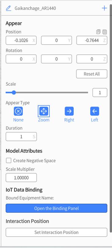
Appear: This option controls how the model first appears onto the screen. For more detailed information, refer to Appear.
Model Attributes: These are settings specific to models, and can only be configured within the first scene that the model appears in.
- Occlude: You can set a primary model as an occluder, where the occluder is transparent but capable of blocking the 3D content behind it. In MR mode, 3D content always appears in front of the real world. If you need real-world objects to occlude the 3D content, you can use the 3D model of those objects and set them as occluders. Although the occluder is invisible, it can block the 3D content behind it, creating the appearance of being occluded by real-world objects. The occlusion function works best when combined with scenario positioning.
Example: Suppose you have a table and you want the table to partially occlude a chair model. You can create a 3D model of the table and set it as an occluder. Although the 3D model of the table is invisible in MR mode, it can block the chair model behind it, making it appear as if the chair is partially obscured by a real table.
- Scale Multiplier: This is a model-only attribute that increases the sensitivity of the Scale attribute based on the number that you enter. This allows you to make models bigger and smaller than the normal scale attribute allows.
IoT Data Binding: This allows you to import external data regarding the behavior of the model in your scenario, such as model movement, rotation, and color changes. This is primarily used to establish a connection between models and digital twin objects. For more detailed information about IoT Data Binding, please refer to DataMesh FactVerse DFS User Manual.
Attachment elements
You can enrich your scenario by adding supporting materials—such as images, videos, audio files, or PDFs—to illustrate model structures, operational steps, manufacturing standards, and more.
Steps to Use:
- Upload the required image, video, audio, or PDF file to the Resources library on the FactVerse platform.
- In DataMesh Studio, go to My Resources under the Resources library to locate the uploaded file.
- Click the resource to place it into the scene—this will add it to the scenario as an Attachment Element.
Images
Images in your scenario can be used as a background for your virtual environment, diagrams that showcase information that is hard to otherwise convey, and blueprints that present a secondary visual aid. This feature increases the effectiveness of your scenario, especially for visual learners.
Supported image formats in DataMesh Studio include JPG and PNG.

Always Face User: This toggles whether or not the image always faces the user, regardless of direction or viewing angle.
Audio
In DataMesh Studio, you can enhance the immersive experience of your scenarios by adding audio files that function as background music or sound effects.
We recommend using MP3 and OGG formats for audio files in DataMesh Studio.
To add audio files to the scene, you can simply drag and drop them from My Resources to the scene in DataMesh Studio. If you need to adjust the attributes of audio files, such as volume and loop playback, you can select the file and modify its settings in the attributes pane. If you want to remove audio files from the scene, you can select the audio element in the scene and click the delete button.
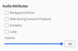
- Background Music: This toggles whether this audio file is played in mono, where there is no sense of direction or dimensionality to the sound, or stereo, where the user’s position changes the direction and effect of the audio.
- Hide During Scenario Playback: This toggles whether or not the audio file is visible when the scenario is in progress.
- Autoplay: This toggles whether or not the audio file plays automatically.
- Loop: This toggles whether or not the audio file restarts from the beginning once it has ended.
- Volume: This allows you to adjust the volume of the audio file.
Video
In DataMesh Studio, you can add video files to a scenario to enhance it with demonstrations, tutorials, or visual explanations.
- Recommended formats: MP4, MOV
- Supports both standard videos and stereoscopic videos (with configurable split-screen and input formats)
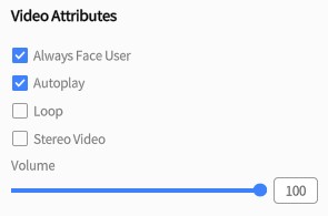
Video Attributes
|
Property |
Description |
Options / Defaults |
|
Always Face User |
Ensures the video always faces the user for optimal viewing |
On / Off |
|
Autoplay |
Automatically starts playing the video when the scene loads |
On / Off |
|
Loop |
Plays the video in a loop |
On / Off |
|
Volume |
Controls the playback volume |
Adjustable numeric value |
|
Stereoscopic Video |
Allows split-screen configuration for immersive playback on Meta Quest devices |
– Half-width Side-by-Side (HSBS) – Full-width Side-by-Side (FSBS) – Half-height Over-Under (HOU) – Full-height Over-Under (FOU) |
PDF documents
You can add PDF documents to a scenario by selecting a PDF from My Resources and placing it into the scene using Placement Mode. This allows you to provide document-style reference material within your scenario.

Tool elements
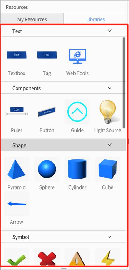
DataMesh Studio provides a variety of built-in tool models in the Libraries panel of the Resources library, including:
- Text
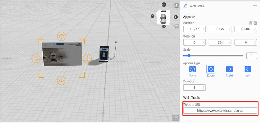
- Components
- Shapes
- Symbols
- Hand Gestures
- IoT elements
These tool models serve as assistive elements during scenario creation, helping users enrich interactions, enhance clarity, or simulate operations.
Adding tool models works the same way as adding regular models:
Simply enter Placement Mode and drop the tool into the scene.
Text
Text is used for showing information, explaining a concept, or describing the purpose of an element in the scene.
In DataMesh Studio, you can add three types of text: Textbox, Tag and Web Tools.
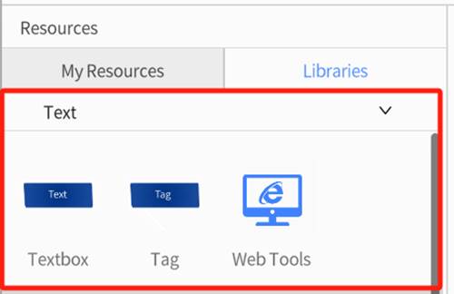
Textbox
You can add a Text Tool to the scene using Placement Mode. The text box supports adjustments to position, rotation, size, and more.
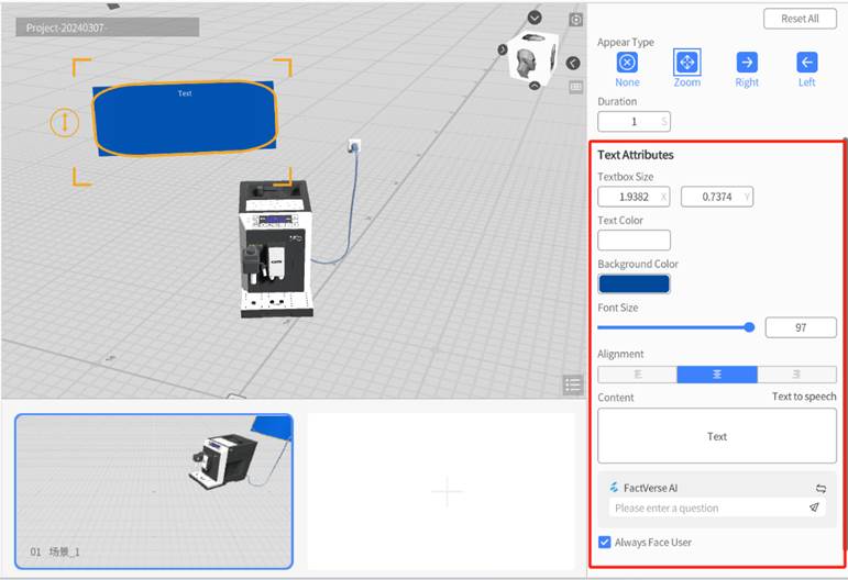
Property Descriptions
|
Property |
Description |
Options / Methods |
|
Text Box Size |
Adjust width and height |
• Drag corner handles • Set values in the Properties Panel |
|
Font Size |
Adjust the font size |
• Slider control • Manual input |
|
Alignment |
Text alignment |
Left / Center / Right |
|
Style |
Text display style |
• Default Style • Quest / Vision Pro System Style |
|
Text Color |
Font color |
Editable in default style; not editable in system style |
|
Background Color |
Background panel color |
Editable in default style; not editable in system style |
|
Content |
Text input (supports line breaks) |
• Manual input • AI Assistant generated |
|
Face User |
Whether the text always faces the user |
• On / Off |
Compatibility Notes
- Studio/One version 7.4 and above: Supports text tools using Quest/Vision Pro system styles.
- Below version 7.4: These styles are not supported. Text tools using system styles will not appear when opening the scenario.
→ It is recommended to upgrade to the latest version for full functionality.
AI Assistant
The AI Assistant feature in DataMesh Studio is built upon the FactVerse AI capabilities of the FactVerse platform. Users can generate textual content through conversation with the AI Assistant.
The workflow for using the AI Assistant is as follows:
1. On the FactVerse platform, create a knowledge base and an AI Assistant. If an AI Assistant is not configured, the system provides a default AI Assistant with no configuration. For more detailed information, please refer to the FactVerse User Manual.
2. In the workspace of DataMesh Studio, add a textbox.
3. Select the textbox, and in the right-side textbox attributes panel, you can see a FactVerse AI tool below the content box.
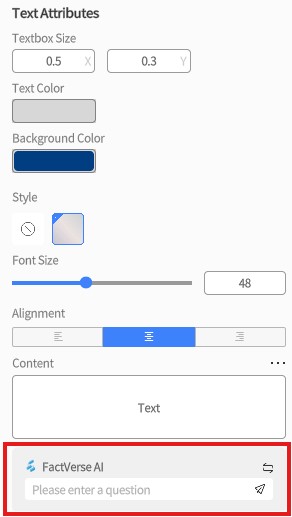
4. Click the switch icon to display a list of available AI Assistants for content generation. If there are no AI Assistants available for switching, the switch icon will not be displayed, and the system default AI Assistant will be used.
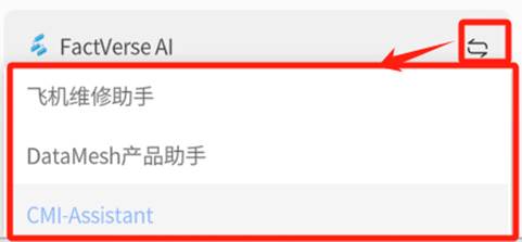
5. Enter a question, and the AI Assistant will automatically generate content and populate the textbox with it.
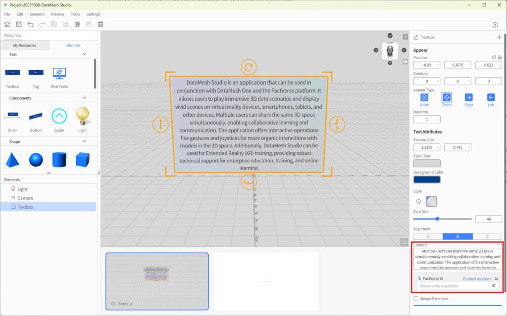
6. Click Text to speech button, and a Create audio window will pop up.
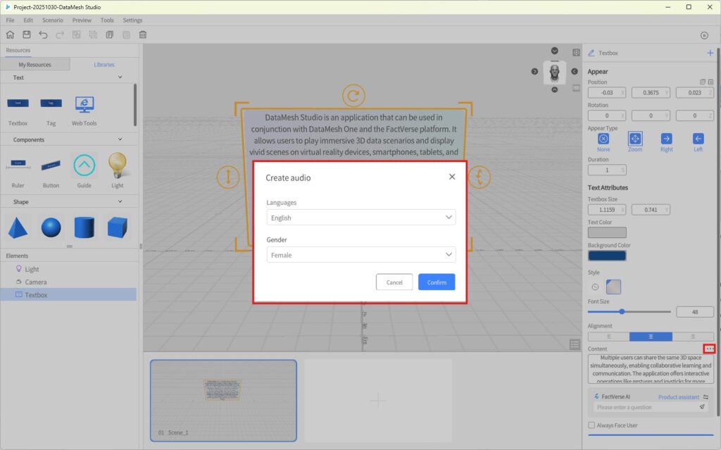
- Language: The language of the audio file, currently supporting Chinese, English, Japanese, and Korean.
- Gender: The gender of the voice for the audio.
7. After selecting the language and gender, click Confirm to create the voice.
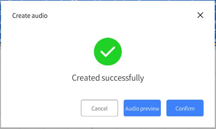
8. Once created, you can click Audio Preview to listen to the generated audio. Clicking Confirm will add the generated audio content to the text box.
9. When editing the content of a textbox that already has generated audio, you will see a prompt saying, “The text content has been changed and does not match the audio.”
Note: This prompt will only appear once during editing. If you reopen the textbox, you will be reminded again when editing.
Tag
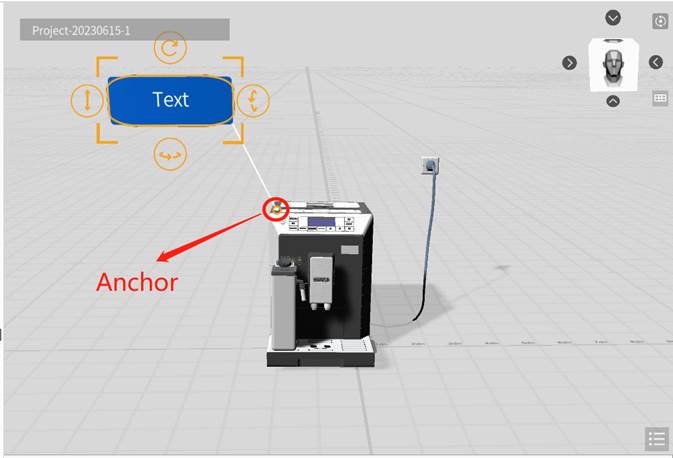
A Tag consists of three elements: a text box, a connector line, and an anchor point.
- After placing a tag into the scene, you can drag the anchor point and attach it to the model you want to describe.
- The anchor point automatically snaps to the model surface and follows its position, while the text box adjusts accordingly.
- Tags serve a similar purpose to the Text Tool, providing users with descriptive text, but with one key difference:
- Tags include an anchor point that can be linked to a specific model or element.
- Tags also support Quest/Vision Pro system-style appearance settings.
Compatibility Notes
- Studio/One 7.4 and above: Supports system-style label appearance for Quest/Vision Pro
- Below version 7.4: This style is not supported. Labels using it will not be displayed during scenario playback.
→ To ensure compatibility, please update to the latest version.
Web Tools
Web Tools allow you to embed live website content directly into your scene, enabling your scenario to display online information or real-time data.
Steps to Use:
- In the Libraries panel of the Resources library, select the Web Tools, then add it to the scene using Placement Mode.
- In the attributes pane, configure the Website URL of the web page you want to embed.
- During playback, the tool will display the live web content. Basic interactions such as scrolling and clicking links are supported.
Components
Ruler
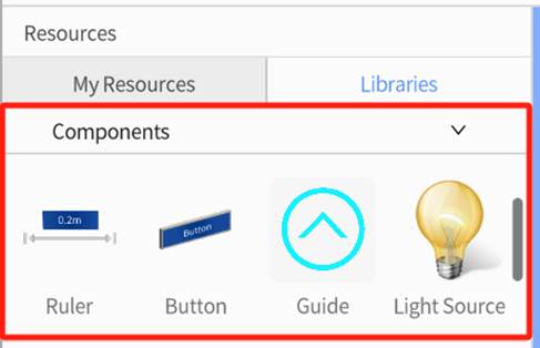
The Ruler can measure the distance of other elements by identifying their horizontal planes. Stretching the four corners of the ruler aligns both ends of the ruler with the ends of the target element, and the measured length is displayed in the middle of the ruler.
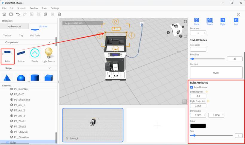
Ruler Attributes
- Auto Measure: When this is enabled, the actual measurement length of the ruler is displayed above it. Otherwise, the content configured in the Text Attributes is displayed.
- Left/Right Endpoint: The X-axis coordinate of the left/right endpoint is relative to the center of the ruler. Therefore, the Left Endpoint can only be entered as a negative value, and the Right Endpoint can only be entered as a positive value.
- Color: This sets the color of the ruler element.
- Size: This sets the size of the ruler element.
Button
The Button is a commonly used interactive tool for triggering actions or switching scenes during scenario playback.
It can be used to display prompts, guide users through a process, or control scene flow.
When a user clicks the button during playback, the system executes the preconfigured action—such as jumping to a target scene or triggering an interaction.
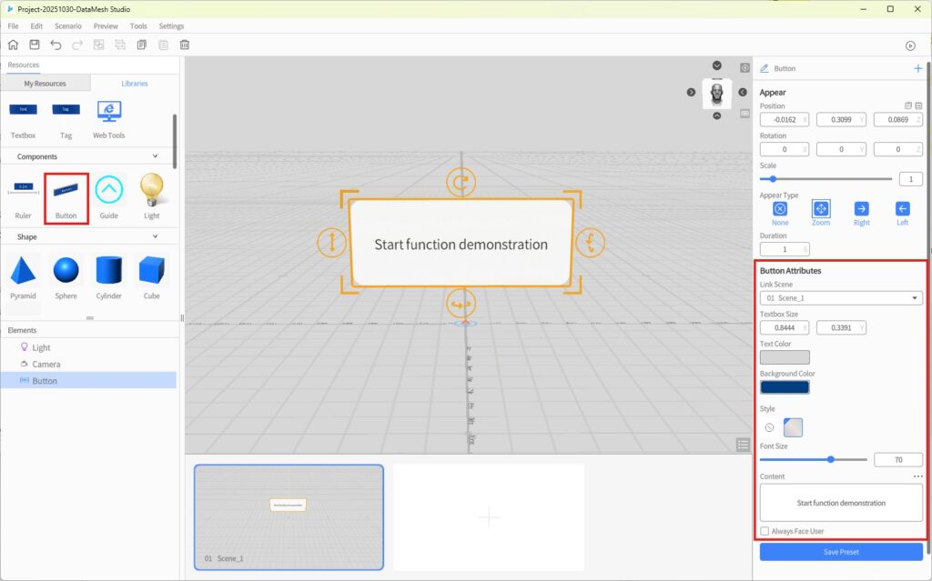
Button Attributes
|
Property |
Description |
Options / Methods |
|
Target Scene |
Sets the scene to jump to when the button is clicked |
Select from dropdown list |
|
Text Box Size |
Adjusts the button’s width and height |
|
|
Text Color |
Font color |
Editable in default style; not editable in Quest/Vision Pro style |
|
Background Color |
Button background color |
Editable in default style; not editable in Quest/Vision Pro style |
|
Style |
Button visual style |
|
|
Font Size |
Adjusts the text size |
|
|
Content |
The displayed text (supports line breaks) |
|
|
Face User |
Whether the button always faces the user |
On / Off |
Compatibility Notes
- Studio / One 7.4 and above: Supports system-style buttons for Quest/Vision Pro
- Below version 7.4: System-style buttons are not supported and will not be displayed during playback
→ Upgrade to the latest version for full functionality
Usage Tip
When creating multiple-choice courseware scenarios, the Button component can be linked to “branching choice questions”, allowing each option to jump to a different scene.
→ For details, see the section on Navigation-based single-choice questions editing process.
Guide
The guide element is a 2D row of arrows that travel forward in a straight line. DataMesh Studio provides four guide style options that change the appearance of the arrows, and you can also modify the size and movement speed of the arrows.
You can find Guide in the Components of the Libraries of the Resources pane and place it into the scene. In the attribute area, you can choose distinctive styles and control properties such as the size and position of the marker.
Light
Lights are used to enhance the lighting effects in the scene, improving the brightness and details of specific areas. When creating a new scenario, the system includes a default light element that operates simultaneously with ambient light. Users can add, delete, manually enable, or disable light as needed to adjust the scene’s brightness. Lights provide illumination for the scene and are automatically hidden during scenario previews to ensure they do not interfere with the scene’s appearance.
You can use the following ways to operate light:
- Add a light: You can add new lighting to the scene by selecting the Light component from the Libraries panel in the Resources library and placing it into the scene area. The newly added light source will appear in the Elements List.
- Delete a light: Select the light to be deleted and click the delete button in the toolbar. Please note that each scene needs to keep at least one light.
- Edit light attributes: After selecting the light, you can edit the light attributes in the attributes pane area, such as light Color, Brightness and Generate Shadows.
- Add movement to the light: You can add movement to the light which is used to simulate light movement, such as sunrise and sunset, and headlights of a moving vehicle.
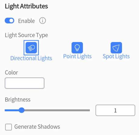
Light Types
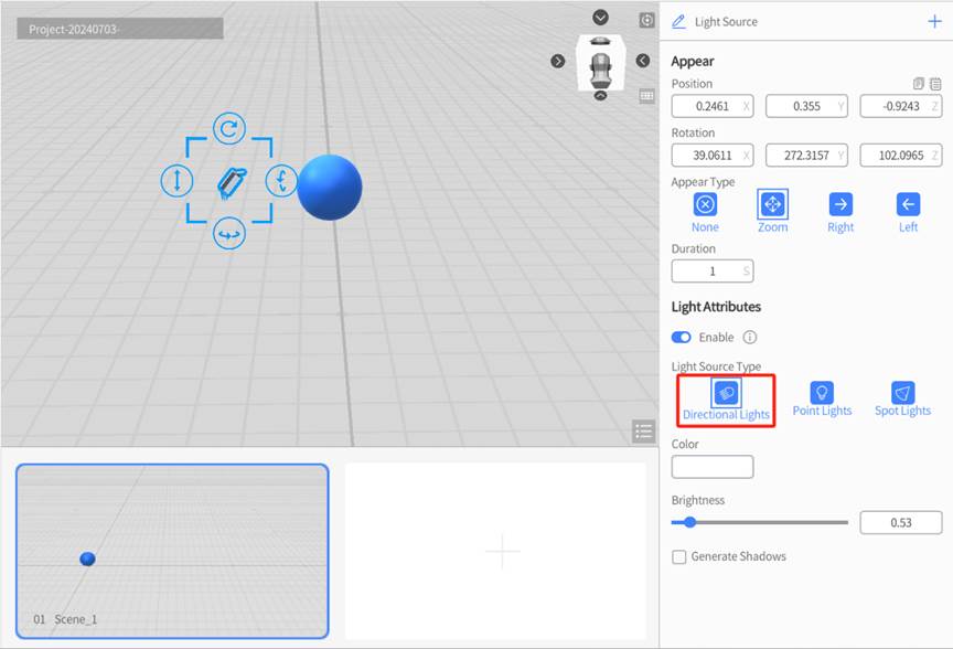
Directional Lights: This type of light illuminates the entire virtual environment in the same direction and can be thought of as sunlight. The light’s source does not come from the element itself, but from a distant point outside of the environment which can be adjusted by rotating the element.
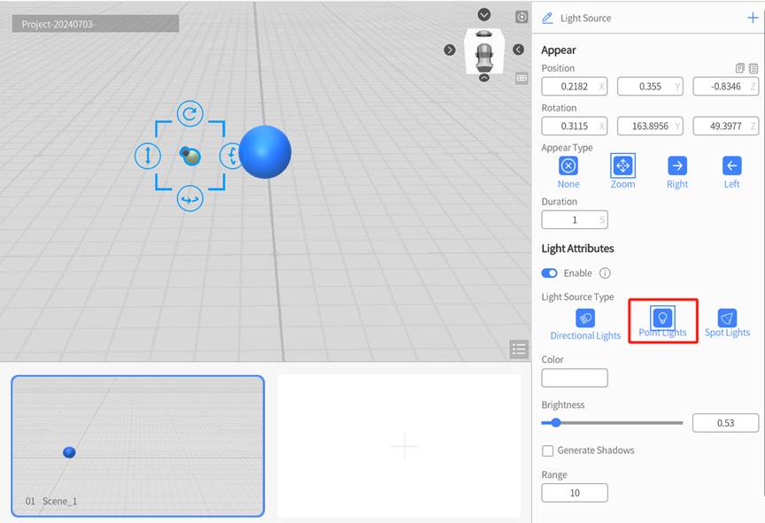
Point Lights: This creates a localized light that illuminates the surrounding environment within a specified radius. Its brightness will decay with distance and will eventually disappear completely once you are out of its range. Point light is commonly used to simulate weaker light such as candles, lanterns, or light bulbs.
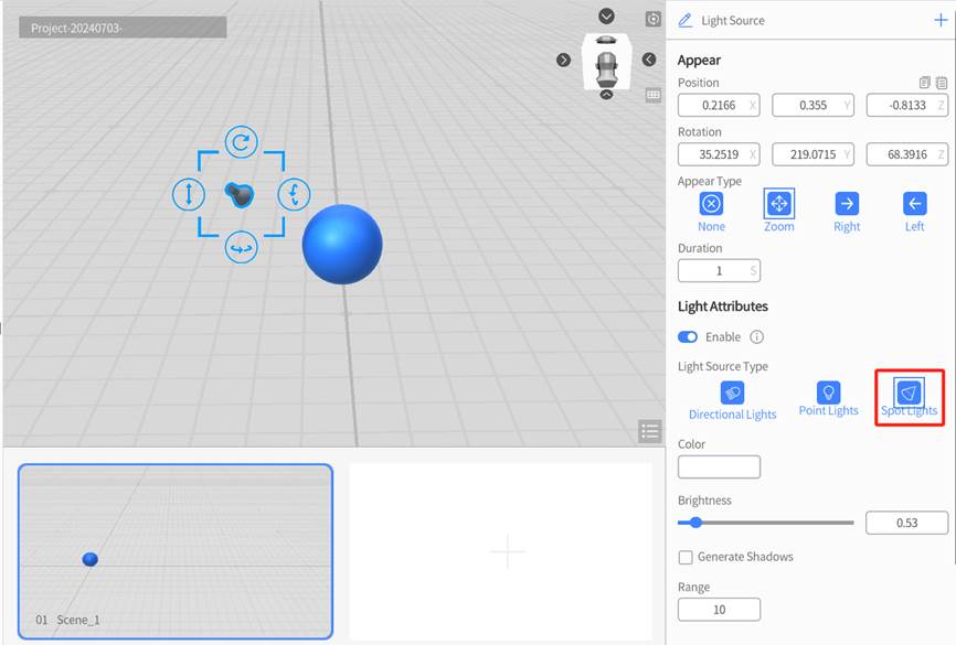
Spot Lights: This type of light narrows its range into a cone shape, similar to a flashlight. Its brightness also decays with distance, but the spread of its range will widen as well. Spot light is commonly used to simulate spotlights, flashlights, and classic desk lamps.
Color
In DataMesh Studio, the default color of a light is white. You can change the color of the light to change the color of the light that shines on the object. Generally, white lights are suitable for “ordinary” lighting used to shade objects.
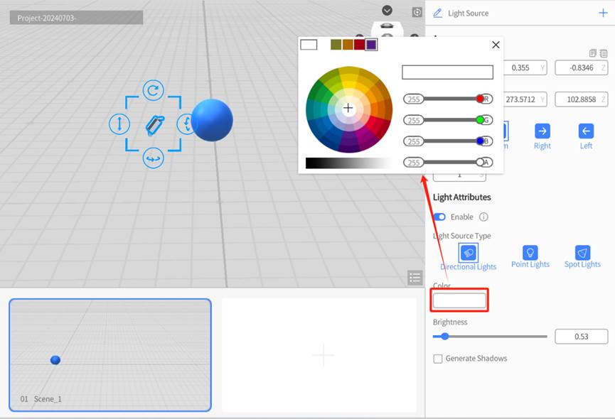
Brightness
Brightness refers to the brightness of the light emitted by the light, which can be adjusted in the range of 0.01-5.00. By adjusting the brightness, you can change the brightness of the light shining on the object.
Generate Shadows
This option toggles whether or not elements generate shadows from this element’s light.
Shapes
DataMesh Studio provides a set of basic shape tools, including:
- Pyramid
- Sphere
- Cylinder
- Cube
- Arrow
These shape components can be used to quickly create visual elements in your scene, helping to enrich the environment and enhance visual clarity.
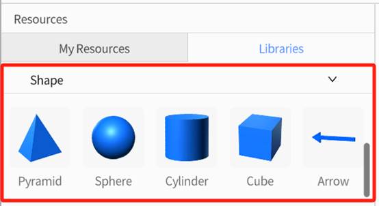
You can set attributes of the shape model in the attributes pane, such as shape, color, base area, and height of the pyramid.
Symbols
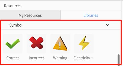
Our library includes several universal symbols that may be relevant based on the needs of your simulation: Correct, Incorrect, Warning, and Electricity Hazard. Symbols are important because they can be applied to multiple different situations and their meanings are instantly comprehensible regardless of language barriers or literacy levels, making your scenario more accessible to all viewers.
Hand Gestures
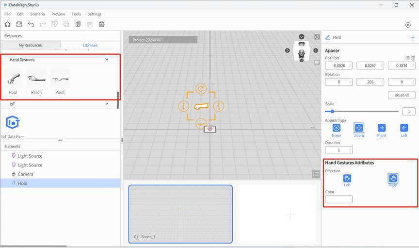
Our library includes three types of 3D hand gesture models: Hold, Reach and Point. These elements can be used to convey meaning, machine operation instructions, and examples of what not to do. The hands can be swapped between left and right in the attributes panel so that you can simulate both hands of the same person doing different things.
IoT Data Pane
IoT Data Pane can be used to display real-time IoT data and simulated data. You can select data in the attributes pane, and set the background color, font size, alignment, title and select digital twins.
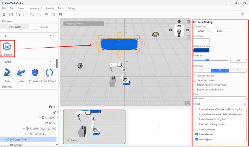
IoT data binding
Click + Select Digital Twins, and a Digital Twin list will pop up. This list displays all the digital twins’ names under this account and supports searching by the digital twin’s name. After selecting digital twins, the original + Select Digital Twins UIwill change to the name of the selected digital twin. Click the name of the selected digital twins, you can select digital twins again.
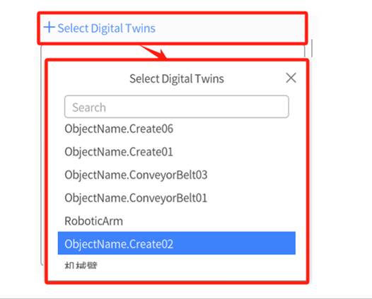
For more details of IoT Data Binding, please refer to DataMesh FactVerse DFS User Manual.
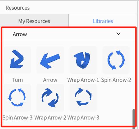
Arrow
Our library includes many different arrows that can be applied to a multitude of different situations.
Special Effects
DataMesh Studio contains many special effects tools, including Lightening, Water Leak, Fire and Gas Leak.
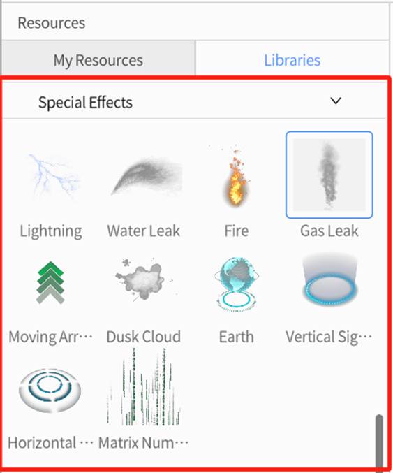
You can find the desired special effects tool in the Special Effects section of the Libraries panel, and place it into the scene. Then, use the Attributes Pane to configure and adjust the effect’s attributes.
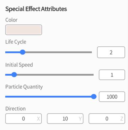
The attribute descriptions for special effects are as follows:
- Color: Changes the color of the special effect.
- Life Cycle: Sets how long the special effect exists, in seconds.
- Initial Speed: Set the initial speed of the special effect.
- Particle Quantity: Set the quantity of particles included in the special effect.
- Direction: Set the direction of particle movement in the special effect.
Custom Widgets
You can save configured tool components as custom presets, making it easier to reuse them in future scenario editing.
All saved custom widgets will appear under Resources > Libraries > Custom.
Add a Custom Widget
Steps
1. Go to Resources > Libraries, select a widget and place it into the scene.
2. Adjust its property settings as needed.
3. Once finished, click the Save Preset button in the Attributes Pane.
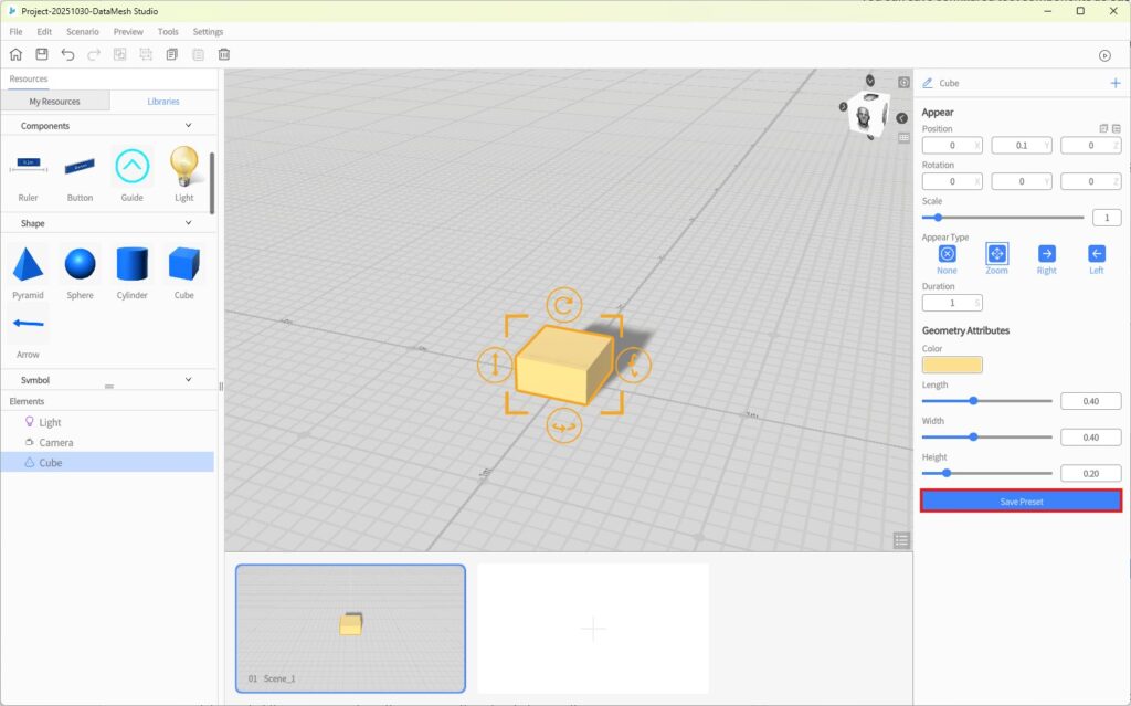
4. Enter a name in the pop-up dialog and click OK.
5. The customized widget will now appear under Resource Library > Tools > Custom, with the same icon as the original widget.
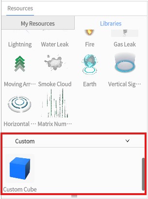
Edit and Manage Custom Widgets
To Update an Existing Preset:
- Select a previously saved custom widget from the Resource Library and place it into the scene.
- Modify its properties as needed.
- Click the Save Preset button.
- In the naming dialog, enter the same name as the existing preset.
- When prompted by the system, click OK to overwrite the original preset.
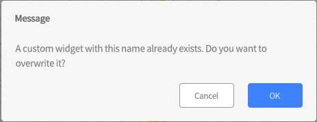
To Rename or Delete a Custom Widget:
1. Go to Resources > Libraries > Custom, right-click the desired custom widget to open the context menu.
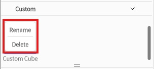
2. Select Rename or Delete to manage the preset accordingly.
Camera
Similar to the light element, all scenarios start out with one camera. However, the camera cannot be deleted, and more cameras cannot be added. Since the camera defines what the viewer sees from the scenario, there has to be exactly one in every scene. By adjusting the camera’s position, rotation, and field of view, you can achieve various lens and motion effects. This capability enables you to incorporate diverse perspectives into the scenario, resulting in a more immersive and captivating experience for viewers of your scenario.
Camera Attributes and Camera POV settings are shown in the figure below:
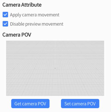
Camera Attribute
- Apply Camera Movement: This option is enabled by default, which means that any movement affects you have set for the camera will occur during the preview. If you are viewing a scenario made using previous versions of this application, you may need to deselect this due to compatibility issues.
- Disable Preview Movement: This option is only available when the Apply Camera Movement setting is enabled. If this option is checked, users cannot move the camera during a preview, and can only follow the camera’s preconfigured path. If this option is not checked, users can freely adjust the camera angle during the preview.
Camera POV
There are two buttons under Camera POV:
- Get Camera POV: This function changes your view of the scene to your camera’s current point of view.
- Set Camera POV: This function changes the camera’s point of view to your current view of the scene.
How to move the camera in a straight line
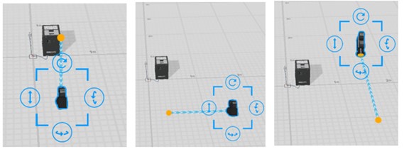
When the view in the scene needs to change, such as bringing the camera closer or further away from the target position, orbiting or hovering around the target position, etc., you need to add pose action for the camera. After adding the action, dragging the camera with the mouse will show a straight-line path from the camera element’s initial position to the mouse position. At the same time, moving or rotating the camera will refresh the camera movement effect in the attributes pane.
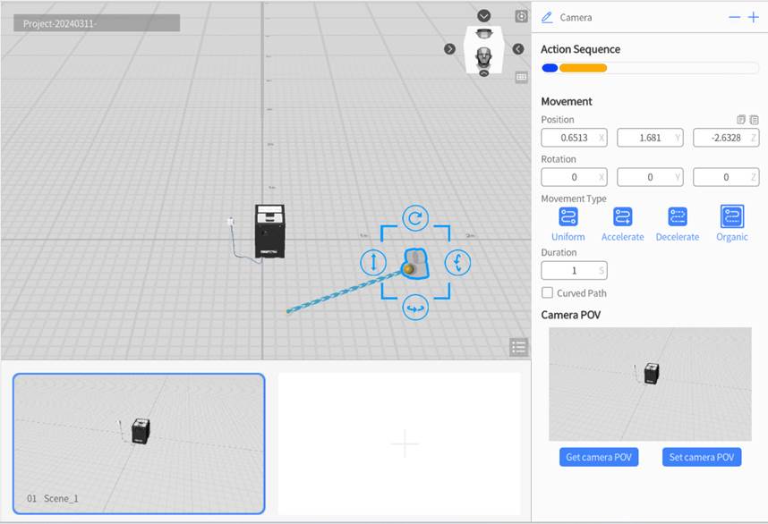
You can follow the steps below to add camera movement in a straight line:
1. Click on the camera to select it, then navigate to the attributes pane and check Apply Camera Movement.
2. In the attributes pane, click the button ![]() next to the element name, then select Movement.
next to the element name, then select Movement.
3. To add a linear movement to the camera, make sure that the Curved Path option is disabled. Then, you can use either of the following two methods:
a) Method 1: Drag the camera to where you would like it to move to, and you can rotate it to change its angle as well. You should see a blue and white line connecting the camera to its old position, which represents the path that the camera will take to reach its new location.
b) Method 2: Change your view of the scene to what you would like the next camera angle to be, then select the camera in the elements pane. In the attributes pane, press the blue Set Camera POV button that is located underneath the Camera POV header. This will bring the camera to your location and set the camera’s point of view as what you currently see in the workspace.
4. In the attributes pane, you can change both the duration value to control how fast the camera moves to its new location, and the movement type in order to control its acceleration along the path.
5. Repeat Step 2-4 to add multiple linear camera movements. You can create a motion trajectory consisting of multiple straight-line segments, as shown in the figure below:
How to move the camera in a curved path
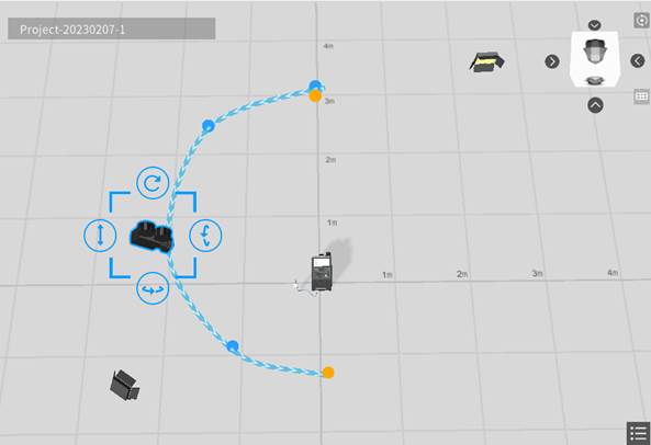
Camera movement in a curved path is an advanced camera movement. By using at least three path points, you can freely configure the positions of these points to create various camera movements in a curved path. Compared to camera movement in a straight-line path, curved camera movements make your scenario more dynamic and visually impactful.
Camera movement in a curved path is shown in the figure below:
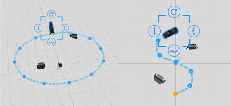
To use curved camera movement, you need to enable the camera movement feature in Camera Attribute, and then add a movement action to the camera. You can set Movement parameters such as Face the Path and Control Point to achieve the desired curve path effect.
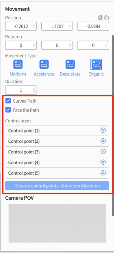
Here are some of the camera attributes that you will need to know in order to move the camera in a curved path.
Curved Path: Enabling this option allows the camera’s path to curve around control points.
Face the Path: The camera direction always stays aligned with the path direction.
Control Point: These are points along the camera’s path that guide the way the path curves. You can set as many as you want, and setting multiple points along one curve allows for more gradual and smoother camera movements.
The steps to create a camera movement in a curved path are as follows:
1. Click to select the camera in the Elements pane and choose Apply Camera Movement in the Attributes pane to enable camera movement.
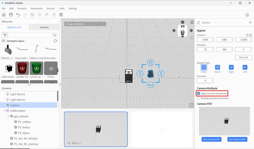
2. Click the button ![]() near the element name to add a Movement action to the camera.
near the element name to add a Movement action to the camera.
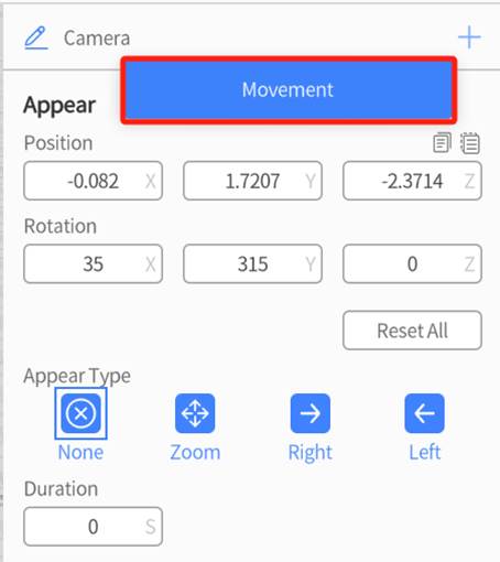
3. In the attributes pane, set Duration and check Curved Path for the Movement action.
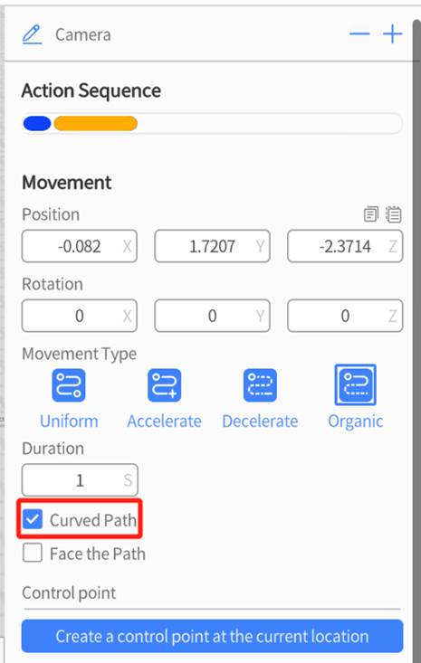
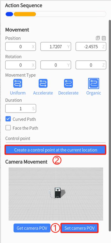
4. To add a curved movement to the camera, make sure that the Curved Path option is enabled. Then, you can use either of the following two methods:
a) Manually create a control point using the camera position: Select the camera and manually adjust its position and rotation angle. Click Get camera POV to create a control point for the curved path.
b) Create a control point using the current view: After adjusting the scene view, select the camera and click the Set camera POV button under the camera effect image. Then click Create a control point at the current position, and the viewpoint of the control point will match the current scene view.
5. Repeat the previous step until you have achieved your desired movement. You can also edit the position and rotation of your camera during previous control points by selecting a control point, then adjusting the camera accordingly.
Extensions
You can design and create custom tools in Unity following the provided tool production specifications. Afterward, use the DataMesh plugin to export your tools as a zip file. Once exported, you can open and view the zip file using DataMesh Importer. You can also upload the zip file to the FactVerse platform, making it available as a built-in tool for use in DataMesh Studio.
You can follow the steps below to add an extension tool:
1. Open the zip file in the Importer and click the Save button to upload the file to the FactVerse platform.
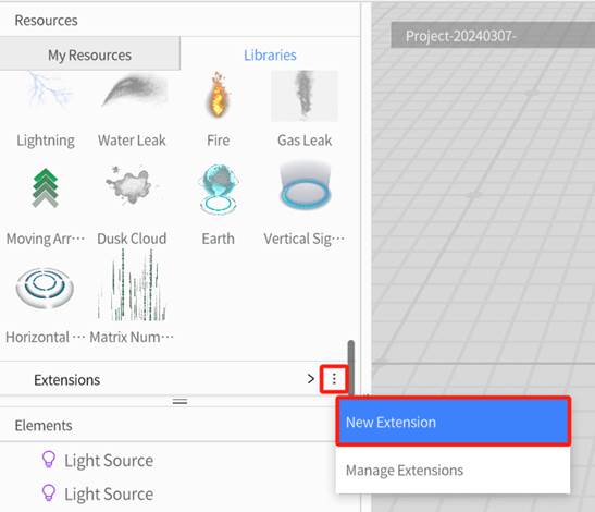
2. Open the libraries tab in the resources pane of DataMesh Studio.
3. Click the ellipsis ︙ icon next to the Extensions header and select New Extension from the drop-down menu.
4. In the New Extension window, fill in Name, and Type and select the extension file from the server.
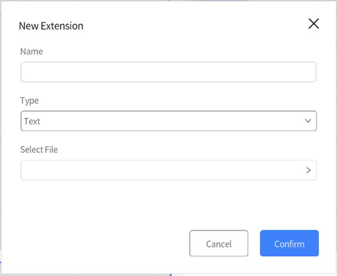
5. Click Confirm. Once configured, you will see the newly added extension under the Extensions section.
Element operations
Placement Mode
Placement Mode allows you to add resources—such as models or tools—into the scene.
How to Enter Placement Mode
- Click a model or tool from the Resource Library
- Use Copy (Ctrl + C or the toolbar Copy button)
- Use Paste (Ctrl + V or the toolbar Paste button)
Behavior in Placement Mode
- When you move the mouse into the scene area, a highlighted green outline will appear to represent the resource to be placed.
- Left-click to place the resource. You can place it multiple times in succession.
- Use keyboard shortcuts to rotate, scale, or reset the object. (For multiple selections, only group rotation is supported; group scaling is not.)
- Right-click to exit Placement Mode.
Keyboard Shortcuts in Placement Mode
|
Action |
Shortcut |
Description |
|
Reset |
R |
Reset the object to its original state before placement |
|
Rotate Left 90° |
Q |
Rotate 90° counterclockwise horizontally |
|
Rotate Right 90° |
W |
Rotate 90° clockwise horizontally |
|
Scale Down |
A |
Decrease size by 0.1x |
|
Scale Up |
S |
Increase size by 0.1x |
|
Free Rotate Left |
Shift + Q |
Continuous rotation left while held; press Q again to rotate 90° from current angle |
|
Free Rotate Right |
Shift + W |
Continuous rotation right while held; press W again to rotate 90° from current angle |
|
Free Scale Up |
Shift + S |
Continuous scaling up while held; press S again to increase size by 0.1x |
|
Free Scale Down |
Shift + A |
Continuous scaling down while held; press A again to decrease size by 0.1x |
When multiple objects are selected, only group rotation is supported—group scaling is not.
Copy and Paste
When you Copy or Paste objects in the scene, the system automatically enters Placement Mode.
The copied object will follow your cursor, allowing you to place it freely.
Copy
- Select an object, then press Ctrl + C or click the Copy button on the toolbar
- The system enters Placement Mode, and the copied object follows the cursor
- Use placement shortcuts (rotate/scale) to adjust position and orientation before placing
- Left-click to place. You can place it repeatedly.
Paste
- Press Ctrl + V or click the Paste button on the toolbar
- The most recently copied object will follow your cursor in Placement Mode
- Use placement shortcuts (rotate/scale) to adjust before placing
- Left-click to place. Repeat as needed.
Notes
- Pasted objects are center-aligned to the mouse position
- Multi-object copy supports group rotation only; group scaling is not supported
- Lights and cameras cannot be copied or pasted
Hide or show an element
If you hover over an element’s name in the elements pane, a button will appear. Press this button to toggle the element’s visibility.
Delete an element
To delete an element, select it by clicking on its model in the workspace or its name in the elements pane. Then, press the delete icon in the toolbar or the delete button on your keyboard to remove the element from all scenes.
Note: Elements can only be deleted in their first appearance scene.
Select an element
To select an element, click on its model in the workspace or its name in the elements pane. A selected element will have an orange outline around it (blue for special elements like light and cameras), along with corner lines that can be dragged to change its size and buttons that can be dragged to rotate it or change its elevation. Dragging anywhere within the corner lines allows you to change the element’s position on the horizontal plane.
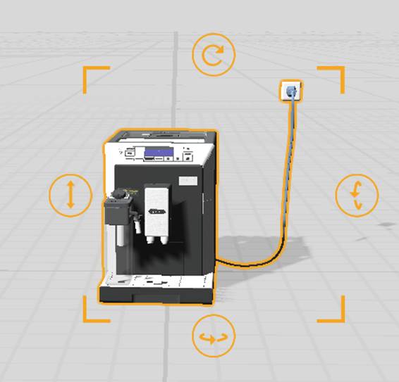
Adjust the movement of an element
When the element is in the state of the Appear action or Movement, you can position and adjust the posture of the element by panning, rotating, scaling, and adjusting the height.
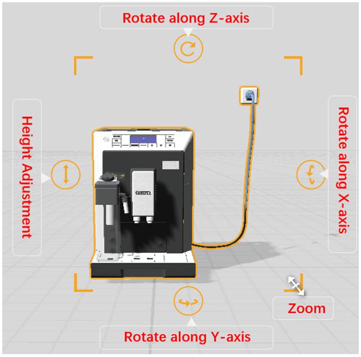
Here are the simple steps to perform these operations:
- Horizontal Movement: After selecting an element, you can drag it anywhere within the highlighted corner lines in order to move it across the horizontal plane. You can also manually change its X and Z coordinates in the attributes pane to fine-tune its new position. When the selection highlight is pink instead of orange or blue, this means that the model cannot be moved in its current state. This occurs when the element’s subcomponents are spread out due to the disassemble effect, or when the element is currently applying the cross-section effect.
- Resize: After selecting an element, you can drag the corners of the selection box to change its size during the scene. You can also change its scale attribute, which will affect its size.
- Rotation: After selecting an element, drag the rotation arrows above, below, or to the right of the selection highlight to rotate the element during the scene. You can also manually input the rotation angle in the attribute pane for precise adjustment.
- Vertical Movement: After selecting an element, you can drag the double arrow icon to the left of the highlight up or down to adjust its vertical movement during the scene. You can also manually input the Y-axis value in the attribute pane.
Move an element via Directional Movement
Using the move tool can quickly and accurately move the element along a straight line, especially when you need to move the element to a precisely positioned location.
Here are the simple steps to drag the element along a straight line using Directional Movement:
1. Click Tools in the toolbar and select Directional Movement.
2. Select the element that you want to move in a straight line during the scene.
3. Three cone-shaped arrows will appear, which each correspond to an axis in the 3D space. Dragging an arrow will move the element along the corresponding axis in a straight line.
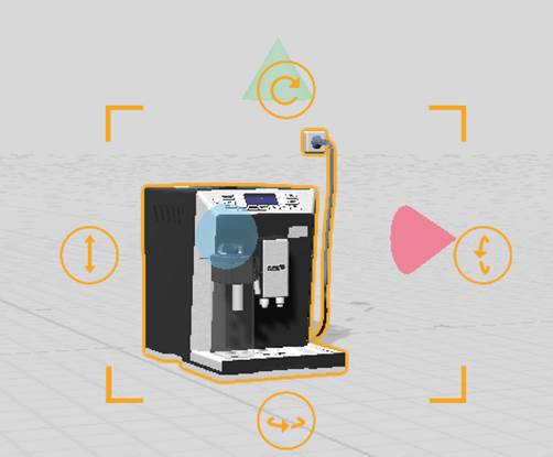
4. After dragging the element to the desired position, release the mouse button to complete the move operation.
Multi-Select Elements
When you need to perform the same action on multiple elements at the same time, you can use the multiple selection operation. To do this, hold down the Ctrl key and add elements to your selection by clicking their model in the workspace or their name in the elements pane.
How to Select Multiple Elements
- Ctrl + Click: Select elements one by one in the scene
- Shift + Click: In the Elements List, click two element names to select all elements between them
Attributes Pane Display
After selecting multiple elements, the Attributes Pane (on the right) will display:
- The total number of selected elements
- The combined center position and rotation of the selected elements
- Input fields for adjusting the overall pose (position/rotation) of the group
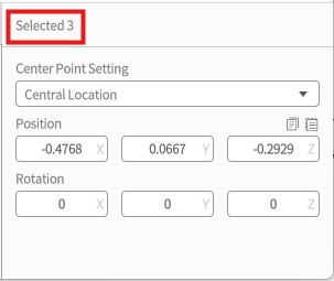
Available Operations
- Move & Rotate: Adjust the position and rotation of all selected elements together
- Copy / Paste: Same behavior as individual elements (see [Copy and Paste] section)
- Delete: Click the Delete button
 on the toolbar to remove multiple elements at once
Note: Child elements cannot be deleted.
- Set Central Point: You can define the center point for the multi-selection in the Attributes Pane.
This will affect how the selected group rotates.
Two central point options:
-
- Bounding Box Center:
Uses the center of the bounding box that contains all selected elements.
→ This is the default pivot for multi-selection.
- Bounding Box Center:
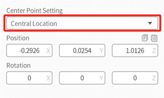
-
- Designated Central Element:
Lets you choose one element within the selection to act as the rotation center for the entire group.
- Designated Central Element:
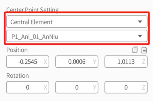
Group
The grouping function behaves like a more permanent form of multiple selection; it combines multiple elements into a single entity and creates a new group element in the elements pane. To create a new group, select all elements that you would like to include, then press the group button ![]() in the toolbar.
in the toolbar.
You can perform the following operations on the group:
- Move and rotate: You can adjust the position and rotation angle of the group by moving and rotating it.
- Ungroup: Select a group, then press the ungroup button
 in the toolbar to disband the group. This causes the group element in the elements pane to disappear, and all elements previously in the group will now behave independently of each other. If you had groups within the disbanded group, those elements would remain grouped.
 - Rename: The default name of a group is “Group” followed by a sequence number, such as Group1, Group2. After creating the group, you can modify the group name in the attributes pane.
- Set the center point of the group: You can set the central point of the group in the attributes pane, which affects their behavior when rotated.
- Central Location: The center point is the midpoint of the bounding box for the group. It is a default option.
- Central Elements: Select one element as the center point from the group.
Note: When you click on an element that belongs to a group, the system will prioritize selecting the group. If you need to select a specific element within the group, click on that element when the group is selected.